And…our first One Room Challenge endeavor is complete!! We did it! 👏 Normally, I lean toward checking something off the list and moving on, but I do want to take a moment to celebrate. 🎉🎉This project required a looong weekend of work to wrap everything up, but final reveal day is here, and I could not be more excited to share the space with you!
If you are new here, KS Design Company is a mother-daughter team working in Topeka and the Kansas City area. You can read more about us here. This is our first time participating in the One Room Challenge. We have been designing a budget-friendly look for my living room, turning it into a functional, casual, and eclectic space in just six weeks. Make sure to catch up on previous weeks (because isn’t the journey is the best part?).
Week 1 | Week 2 | Week 3| Week 4| Week 5 |
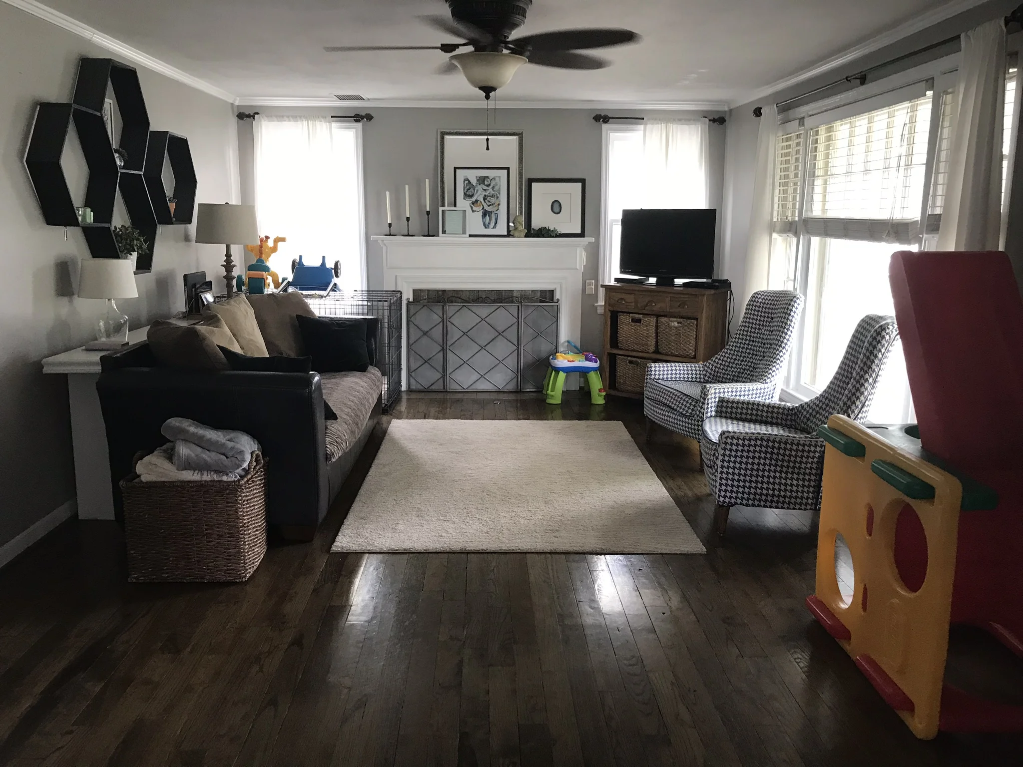
To get us started, here is a before photo. There wasn’t necessarily anything wrong with the living room before, but it is our family’s main living space and had stayed the same for eight years. I wanted it to better reflect my taste and to be more functional.
So, we waved our magic wands…and…
Ta-da! The new space! The room feels bright and calm, fairly neutral but not boring. The top goal going into the project was increasing functionality. One aspect of that was providing more seating for when we have family and friends over. The sofa was purchased from a local store, and beyond my love of its rich navy color, this thing is long and can easily seat four people.
Wall Paint | Rug | Chaise Lounge | Fan | Window Pane “Throw”
The room is on the smaller side, so the furniture configurations are limited. I knew something would have to go in front of the picture window. We previously had chairs, but I thought our family our dog would enjoy a secondary sofa more. I chose a chaise lounge because it blocks the window less than a traditional loveseat or apartment sofa. The chaise lounge was a steal of a deal, but it is very sturdy and the fabric is a very soft black velvet.
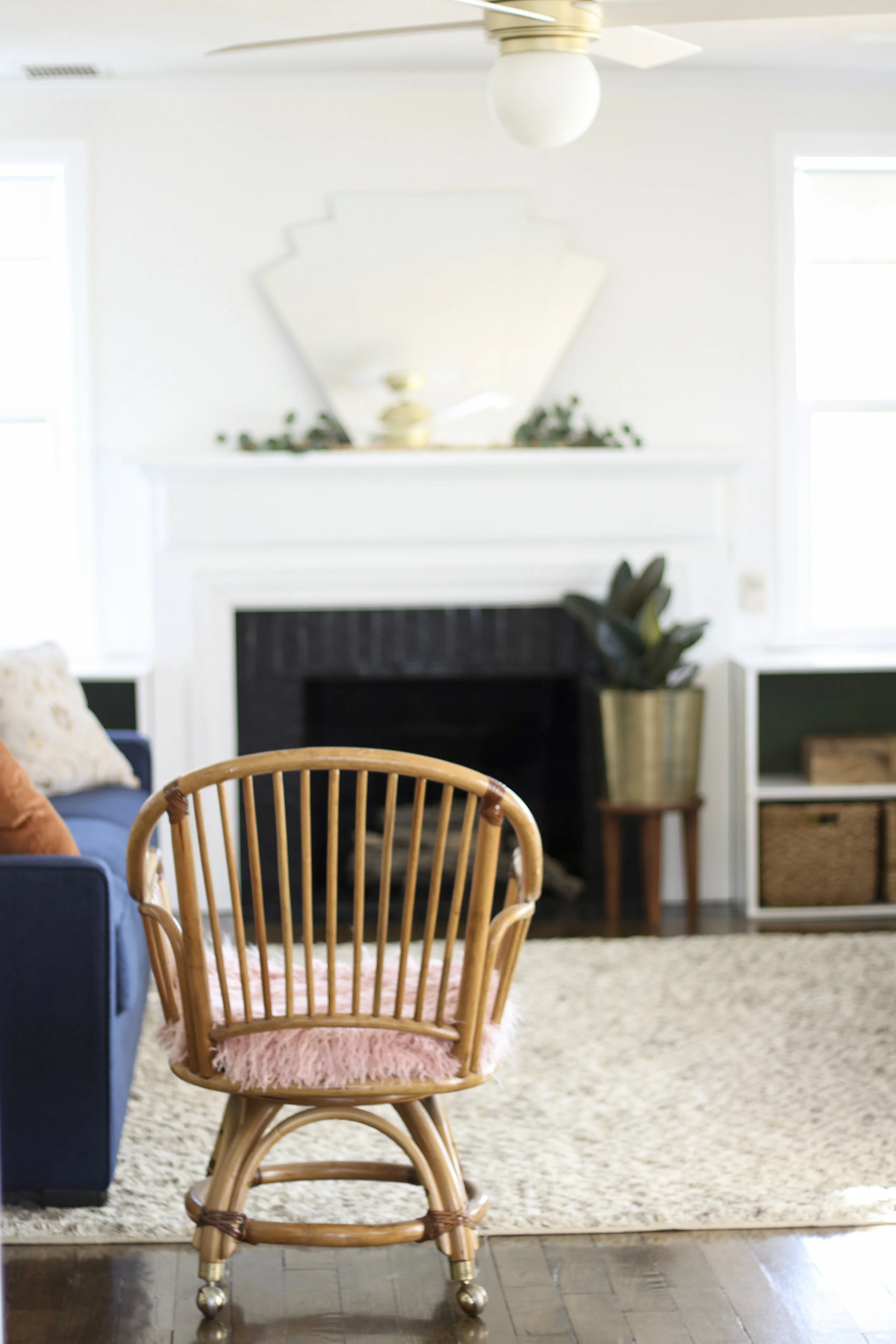
Finally, the rattan chair provides one more seat but isn’t visually heavy in the room (and the casters allow us to easily roll it into the dining room if extra seating is needed there).
Baskets | Green Paint (Sierra Night from Pratt & Lambert)
The other main component of functionality was increasing toy storage. To this end, my dad built shelving to flank both sides of the fireplace. The shelving can hold up to twelve wicker baskets, which is our method of choice for housing toys, but so far six baskets hold the toys easily. (Grandparents: this does not mean we need more toys). My toddler has already taken a liking to the shelves and can easily pull out his baskets of toys when the desire strikes.
Hello there, sleek looking fireplace. The fireplace hearth was painted using a high heat paint, and the outside brick was painted a glossy black. The hearth was retiled with a soapstone-esque tile. My husband did the backbreaking work of removing the old tile and laying the new, but I did learn a new skill (thanks YouTube!) and grouted it. We chose a dark charcoal grout because we wanted the material of the tile to catch the eye, rather than its hexagonal shape. The overall look is much more cohesive, and the black adds a bit of drama to the focal point of the room.
Doesn’t the DIY art deco mirror look like perfection above the fireplace? It makes a statement even with simple accessories. Actually, after my mom and I spent a lot of time playing around with the mantle, we decided it looked best with simple accessories. I guess the mirror knows its the star.
We chose to install pull down shades instead of curtains for the windows flanking the fireplace. Pros of this choice: very affordable, Lowes cuts them to size, they keep that angle of the room looking clean-lined. Cons of this choice: boring. To spice them up, we added DIY leather tabs. My mom cut a strip of faux-leather, used an awl to punch a hole in the shade, and then inserted the brass post fasteners (sold in the leather supply section of a craft store). Originally, I had my heart set on a leather sofa, but that wasn’t working with budget, so we tried to find places to add touches of leather instead. I think it’s those little details that make the room special.
Clock | Art (Home Goods) | Bunny Bowl (thrifted) | Chair (handed down)
I thought I wanted a kids’ table somewhere in the space, but real estate is so precious in our living room, so I wasn’t 100 percent sure. After texting all my friends—Is a kids’ table worth it??—and getting a resounding yes, I knew it was time to get creative. My dad built a flip-down kids desk for the space between the picture window and the door. At 20x30 in, it has a large work space when it is flipped down, but once my toddler is finished playing or crafting, then away it goes. Plus, it hides all the art supplies.
My toddler thinks it is such a treat to play on a table built for his size, and he loves his “big boy” chair. The chair is a vintage Kindergarten chair that my brother used as a child. 😍
The top of the desk acts a command center of sorts and has a couple necessities in our life—a clock that can be seen from anywhere in the room and a clipboard where we can hang invitations, reminders, photos, or whatever is making us happy that week.
Let’s talk curtains and curtain rods. I got it into my head that I wanted pinch-pleat curtains but didn’t have the time to add that to the DIY project list. IKEA to the rescue. Although the curtain had to be hemmed because IKEA sells 98” as their shortest length, I am really happy with weight of the curtain and the pleating. And the price, of course!
I wanted to keep the curtain rod to save some money, but it was not my style. Then I realized that actually the finial wasn’t my style. My mom came up with an easy and striking DIY for a new finial. First, she cut down long styrofoam rods to the finial length we wanted. Then, she wrapped them with faux-leather using straight pins to hold the leather in place on the backside. Finally, she painted both open ends with craft paint, and using the screw from the old finial stuck it into the styrofoam so the entire finial could then be screwed back into the rod.
After our wallpaper woes, I am happy to report that the framed wallpaper entry turned out beautifully. We loosely followed this tutorial to hang the molding, which we painted navy prior to hanging. Why is black and navy taboo? It is perfection in my book.
Painting the door green was a last minute decision, not a part of the original plan. We had leftover green paint from painting the back of the shelving and decided to just go for it! So, off its hinges the door went. We rolled the door on sawhorses set up in the middle of the living room late Sunday night. What a good decision. It complements the wallpaper so well and adds a extra oomph to that area of the room. And that green…I just can’t get enough.
When you walk through the front door, the altered portrait (aka Dapper Dan, aka Decapitated Dan) greets you. My husband thinks it’s an odd choice, but I can get behind quirky elements, and this art print fits the bill.
Floor Lamp | Sconce | End Table (Home Goods)
The other area of the room that needed artwork was behind the sofa. I wanted one large print that was still affordable. Jenny Komenda posted about printing art on vinyl in her Instagram stories, and it ended up being an excellent solution. I purchased a print, took it to my local printer where they printed it on flat vinyl. They printed it to fit the IKEA canvas frame, which comes in white, black, or gold. The print cost $20, the printing cost $107, and the frame cost $29. That totals $156 for a large piece of art—not too shabby.
The sconce that I lucked into flanks one side of the art. It is large and makes a statement in the room, but it is also very functional and gives off a lot of light. A modern floor lamp flanks the other side, and the great thing about that lamp is it has three levels of brightness.
My friend Natalie whipped up the two oversized throw pillows. To add a touch of leather to this side of the room, she sewed a leather stripe through one. Both pillows turned out fantastic! The smaller throw pillows I had to hunt around for. The copper-toned velvet adds some warmth. The hints of blue and gold in the distressed pattern tie into the sofa and the frame behind the sofa (and the pillow has leather trim!).
Well, that about wraps it up for our first One Room Challenge. There are few people that must be thanked. First up, my husband, Matt, for allowing our house to be in chaos while we worked on the living room and for giving up several weekends to help with many projects. Second up, my friend, Natalie, who sacrificed several evenings to sew cushions, pillows, and hem curtains for the room. She has rightly named herself the Clint Harp of our operation. Last up, my dad, Lance, who built two big elements of the room and came up two days in a row to help with installing elements. I have named him the Jimmy Don of our operation. 😄
Also, a big thank you to One Room Challenge, especially the creator Linda Weinstein, and Better Homes and Gardens for organizing everything. Make sure you look at the final reveals of the 20 featured designers and the other guest participants. So. much. inspiration.
We would love to hear from you in the comments! Your comments really and truly make our day. What is your favorite part of the room?
Also, keep up with us on Instagram—holiday decorating is right around the corner!
XO, Kylie


