After a last minute decision to participate in the One Room Challenge, last week we left off wondering if we should go light and bright in the home office or if we should go dark and moody? Well, we talked it through and are going for all things ✨light and bright✨.
The decision really came down to wanting to reuse some white bookshelves but not wanting to paint them (for fear of them not handling paint that well). We didn’t want the bright white bookshelves to look too stark against dark walls, so light walls made the most sense.
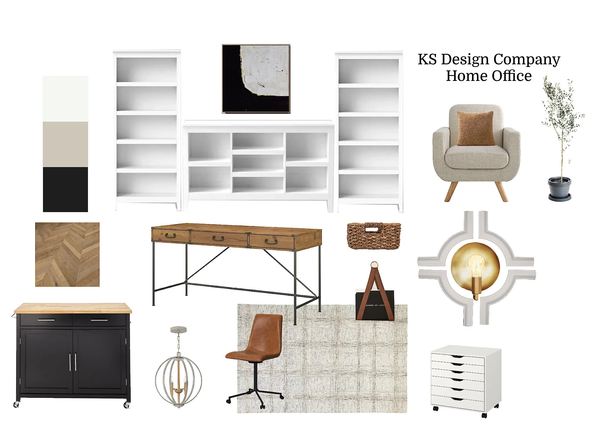
With that decision made, the design could really take off. So…🥁🥁🥁…here is the office design!
It’s neutral. It’s full of texture. It’s functional with LOTS of storage. I mean, all work done in this office should be calm and refreshing because of the all the tranquil vibes this design is giving. 😉
Design Breakdown
Storage Needs
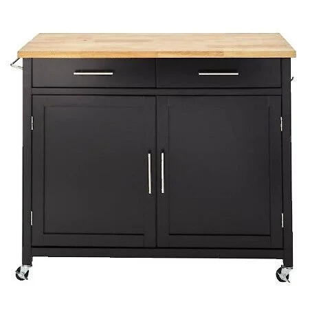
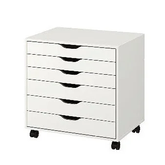
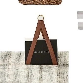
Besides the massive bookshelves that will provide storage, we plan on making some upgrades to a kitchen cart (we’re excited for the challenge of this one and hoping it turns out well 🤞). We will also add an Ikea storage unit, and then hang some beautiful/functional wall storage, like these file folder holders.
Flooring
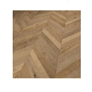
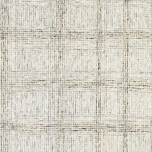
The flooring will be a bit of a toss up! The end goal is a wood flooring laid in a chevron pattern (left image). And that will happen—just potentially not on the ORC timeline. If the flooring cannot go in before the final reveal, then we plan to get a rug (like the right image) to place over the carpet that is already in the room.
Other Touches
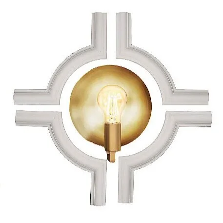
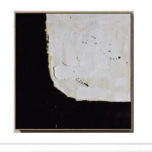
We are going to try our hands at a few fun projects: revamping an old light fixture so it looks similar to the inspiration on the left, adding some millwork to the wall (perhaps highlighting some wall sconces), and DIYing some large art.
Floor Plan
The floor plan of the room will stay similar to the current one, but since every aspect of the room is getting an upgrade, we don’t mind. We actually played around with a few other floor plan options, but this one made the most sense. Here are some aerial and side views, so it is easier to conceptualize the space.
To keep on track, here is our to-do list. Italics indicate the item is in progress.
Choose a paint color for walls and trim
Decide on flooring (dependent on time frame)
Paint walls and trim
Source a desk or paint the one we have
Source or DIY art
Millwork
Source lighting
Source chairs
Decide if we want a window treatment
Source or DIY a rolling cart
Source organizing options: baskets, bins, boxes
Source labeling options for baskets
That’s it for this week of the One Room Challenge. Check back next week for progress updates!
See you next week,
Kylie and Staci
