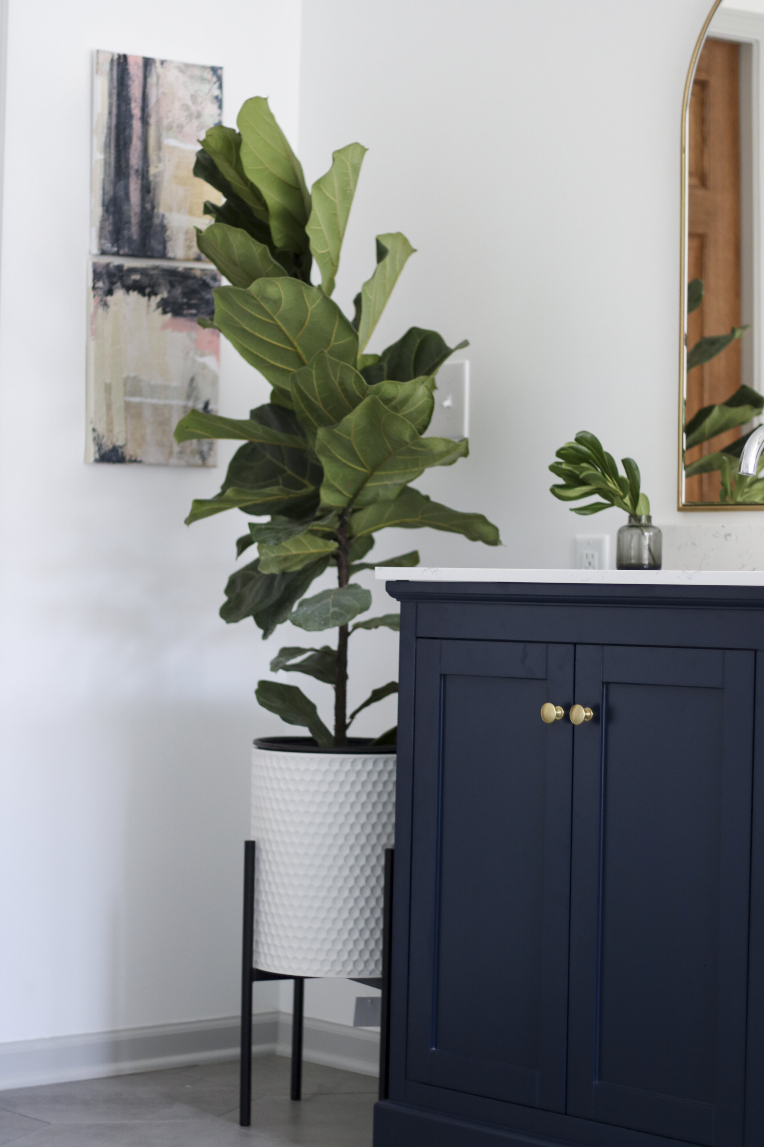
Right off the main bedroom, the main bathroom has that wow factor and continues those modern traditional vibes. Get ready for a fun before and after!
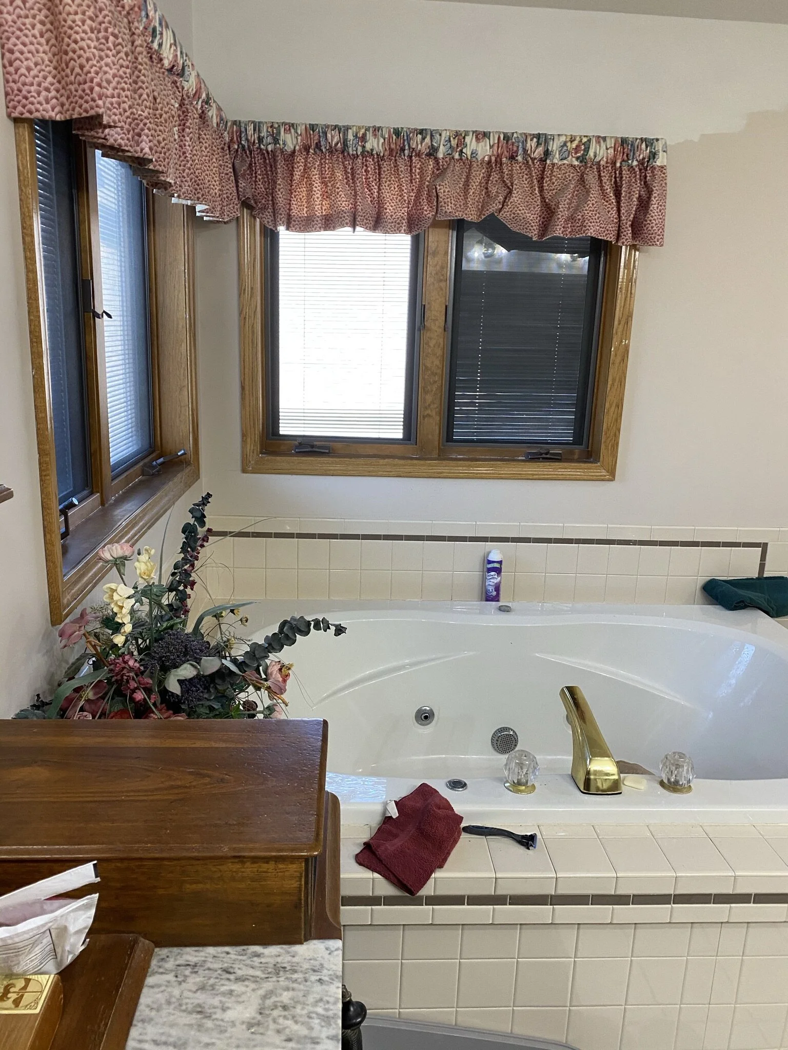
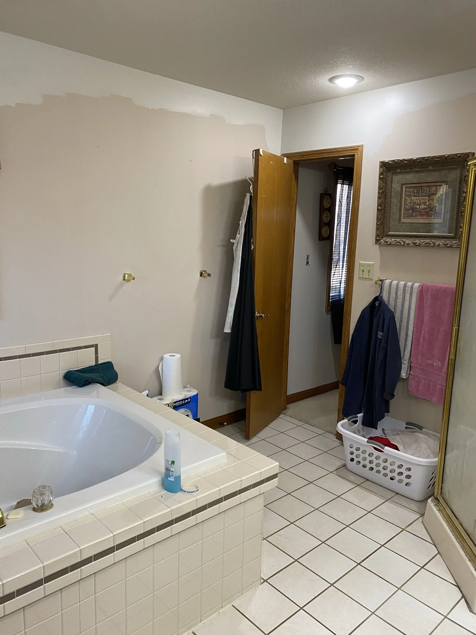
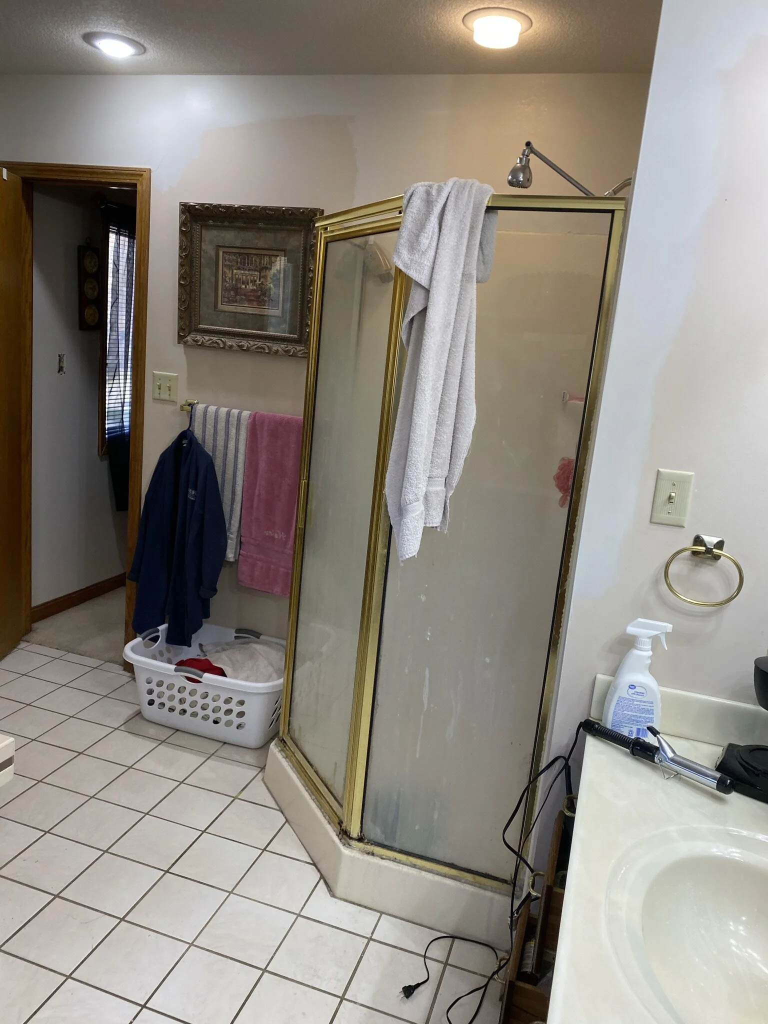
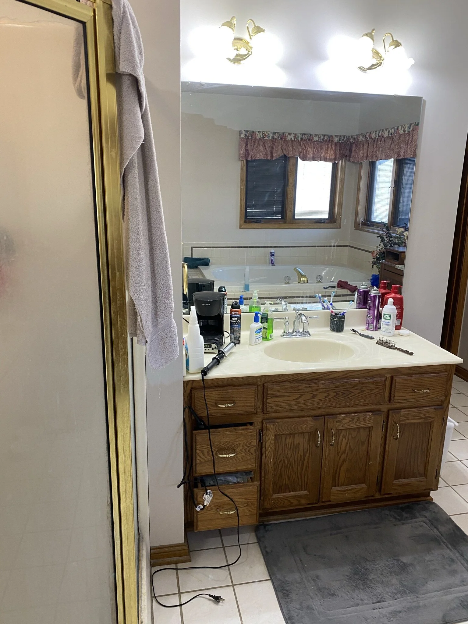
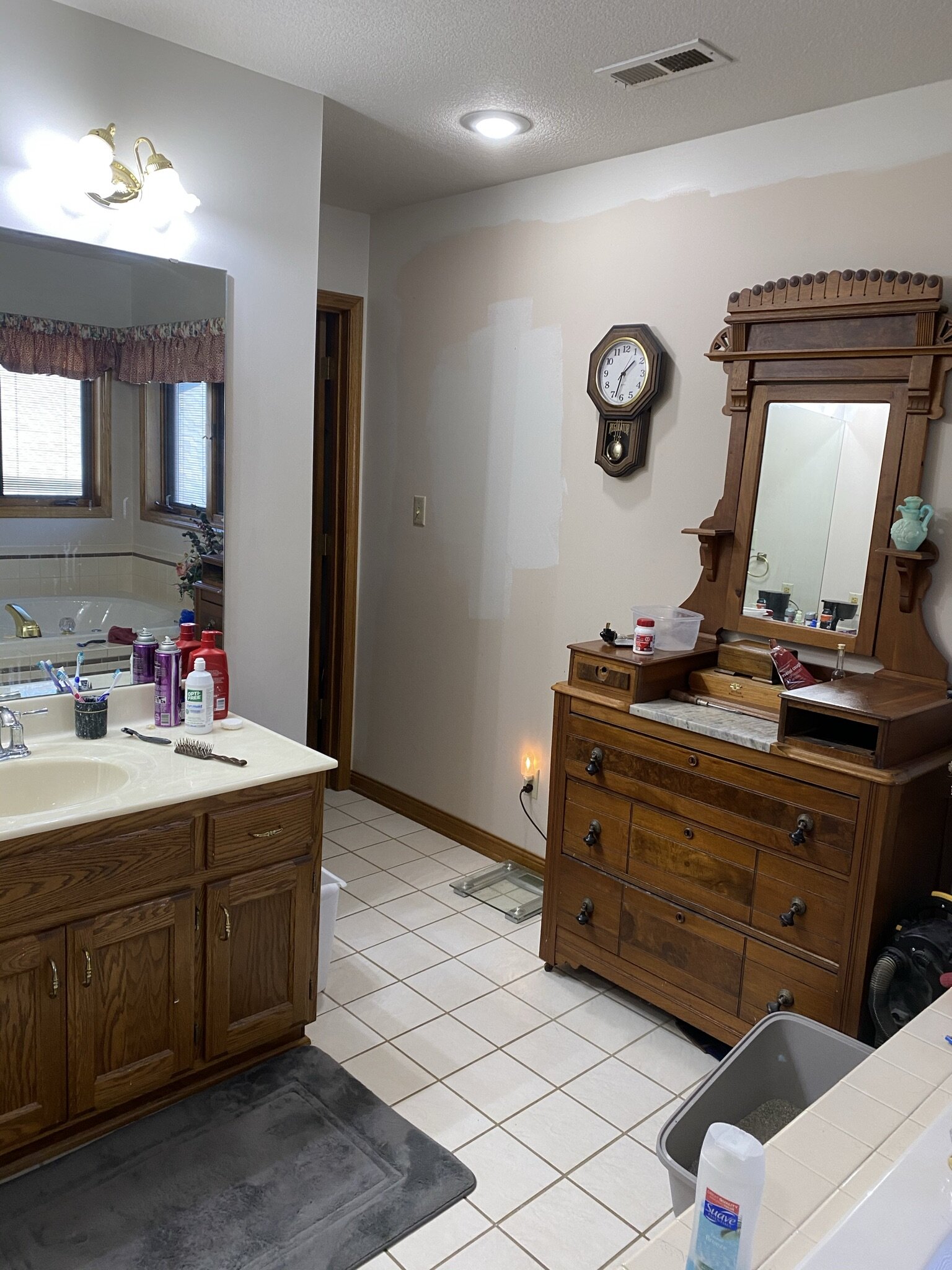
The Before
The main bathroom hadn’t been truly updated since the homeowners built the house in 1990. The homeowners’ priority was to make the space more functional. The shower felt cramped, they didn’t love having the toilet in a water closet, and the location of the vanity didn’t allow for a double sink. The solution? A new footprint for the bathroom!
The After
Quite the change, right? Reworking the layout made all the difference. First up, the water closet was removed. Taking down those two walls that separated the toilet from the rest of the room instantly opened up the space and made it feel brighter. The vanity, which had previously been on a wall housing the water closet, was moved across the room. Instead of having a single sink, the homeowners could now fit a double sink. The bathtub and shower stayed in the same locations, but the shower was expanded.
Vanity Area
Mixing metals can feel risky, but it almost always pays off, and the vanity area is a prime example of how gorgeous chrome and gold can look together. The sconce between the vanity mirrors is not only a knockout piece, but the mix of the two metals pulls it all together.
Side Note: Another aspect to consider is shape. With rectangular mirrors, this area would read a lot more boxy. The subtle curve of the arched mirrors brings something extra, and it matches the curve of the facets.
Bathtub Corner
Who doesn’t love a good soaking tub? This one is that nice mix of modern and traditional. But the most delightful aspect of this corner is all that natural sunlight from the windows. Taking out the blinds within the windows and painting the trim were easy fixes to keep that corner extra airy and bright. That corner of the house doesn’t face any neighbors, so window treatments weren’t even necessary. Let in all the sunshine, please. ☀️
Flooring and Rug
The floor tile is an 18-inch hexagon. The cement gray color acts a neutral backdrop for all the other bathroom elements. And the best part that you can’t see? The floor is heated. So heavenly.
The runner in front of the vanity is actually a Ruggable, a rug where the top layer can be removed and washed. This concept works well in any bathroom but especially works well in a bathroom that the homeowners’ cat likes to hang out in. Plus, that blue color really pops.
Lighting
The overhead lighting definitely adds a bit of sparkle to the space. ✨ That natural light from the windows shines through the pendant light and projects a glistening pattern onto the ceiling. It’s probably the closest you can get to having a disco ball in your bathroom.
Side Note: Going fun with lighting can add just the right amount of whimsy to a space.
Little Touches
We kept the accents minimal and continued the colors from the main bedroom: blue, black, and gold. The goal was simple and pretty accents.
Side Note: It’s inevitable that you will be putting some things on bathroom surfaces (soap, makeup, etc.), so keeping bathroom accents minimal and functional, mainly plants and candles, helps the surfaces from feeling crowded.
Wall Art
The art for the room came together organically, and we didn’t end up sourcing a single piece! For behind the fiddle leaf fig and next to the ladder holding towels, the homeowners’ daughter-in-law painted three beautiful pieces: two mixed media canvases and one landscape of Branson, a favorite vacation destination for the family. On the bathtub wall, we used two pieces that the homeowners already owned, and they worked really well stacked vertically, bringing some blue to that side of the room.
Shower Area
We wanted the tile choices to feel timeless without veering into boring. A subway tile laid in a running brick pattern definitely falls in the timeless category, but picking a subway tile that came in variegated shades of white/gray/taupe adds that visual interest. The small hex tile works so well in the shower pan because it mimics the shape of the bathroom floor tile, mimics the colors of the shower wall tile, and the small shape keeps the shower floor from becoming too slippery.
Side Note: Bathrooms can easily become too sterile, so little touches of organic materials go a long way. The teak shower bench and the wooden towel ladder break up the whites and grays.
Honestly, we wouldn’t mind having this bathroom in our own homes. 😉 But, we are so glad that the homeowners will get to enjoy this little oasis for years to come.


