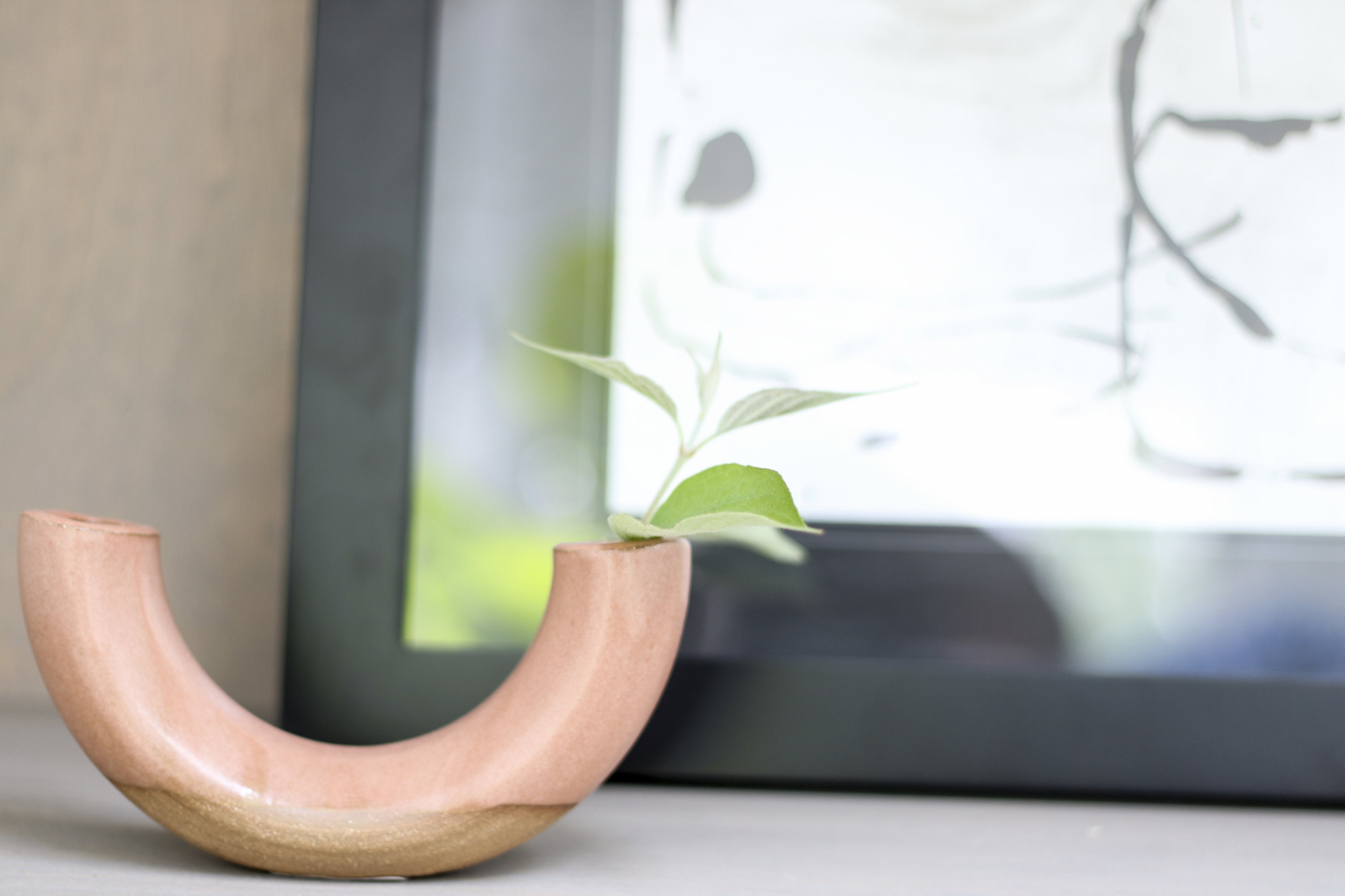
Final reveal day is here for The One Room Challenge! We worked up to the last minute on the sunroom—why take pictures ahead of time, when you can take them the day before?—but it is all the things a sunroom should be: light, bright, and comfortable. All in all, it’s lovely.
If you are coming from ORC and new to KS Design Company, welcome! We are a mother-daughter design team working in Topeka and the Kansas City metro. We started KS Design Company last summer and completed our first One Room Challenge last fall.
With Instagram, it’s so easy to only appreciate a beautiful end result. But, of course, there’s a lot beauty in the process too. That’s one of our favorite aspects of The One Room Challenge: the focus on the journey to the final design. If you’re interested in our journey, make sure to start at the beginning of the sunroom posts.
Week 1 | Week 2 | Week 3 | Week 4 | Week 5
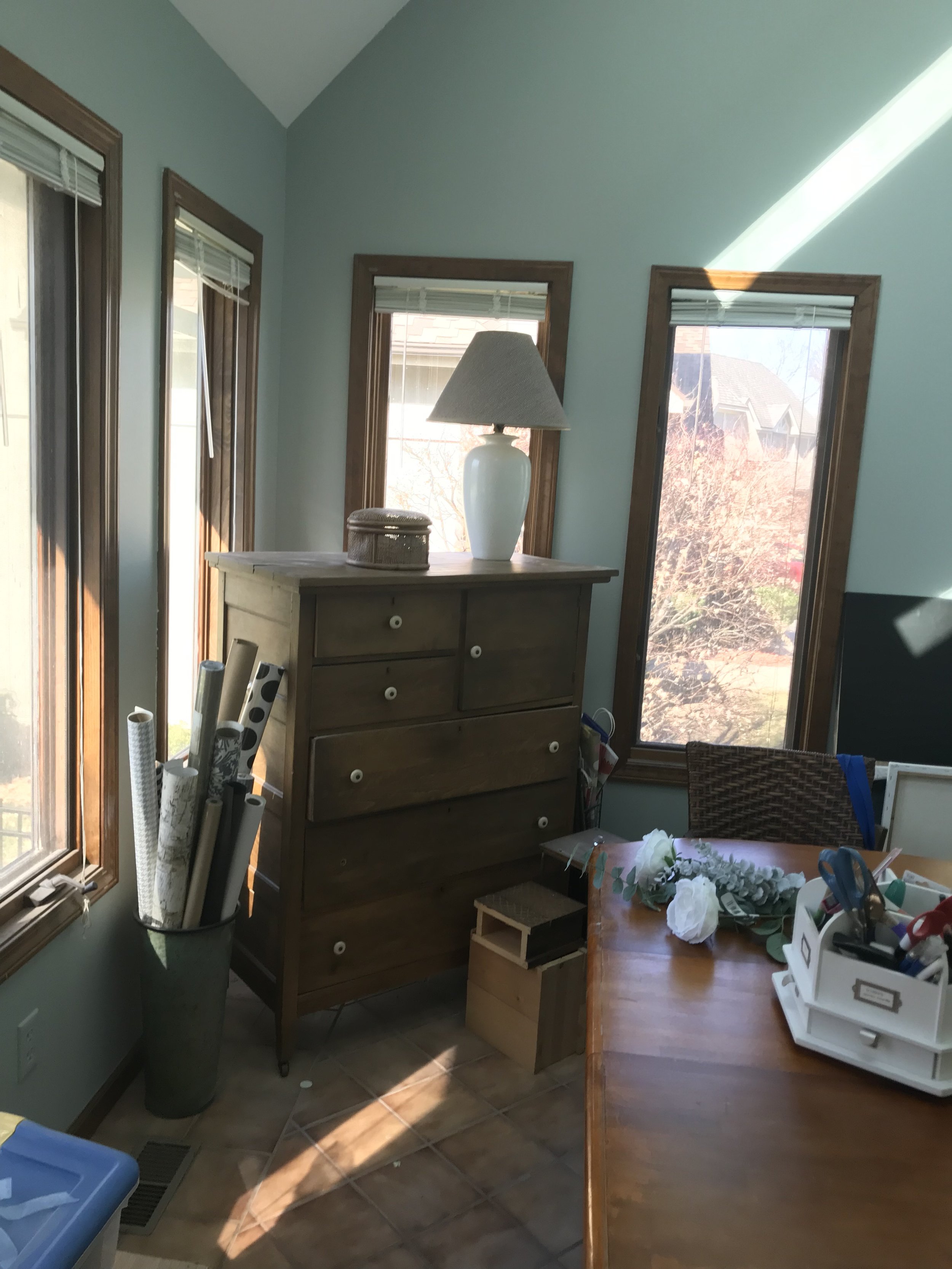
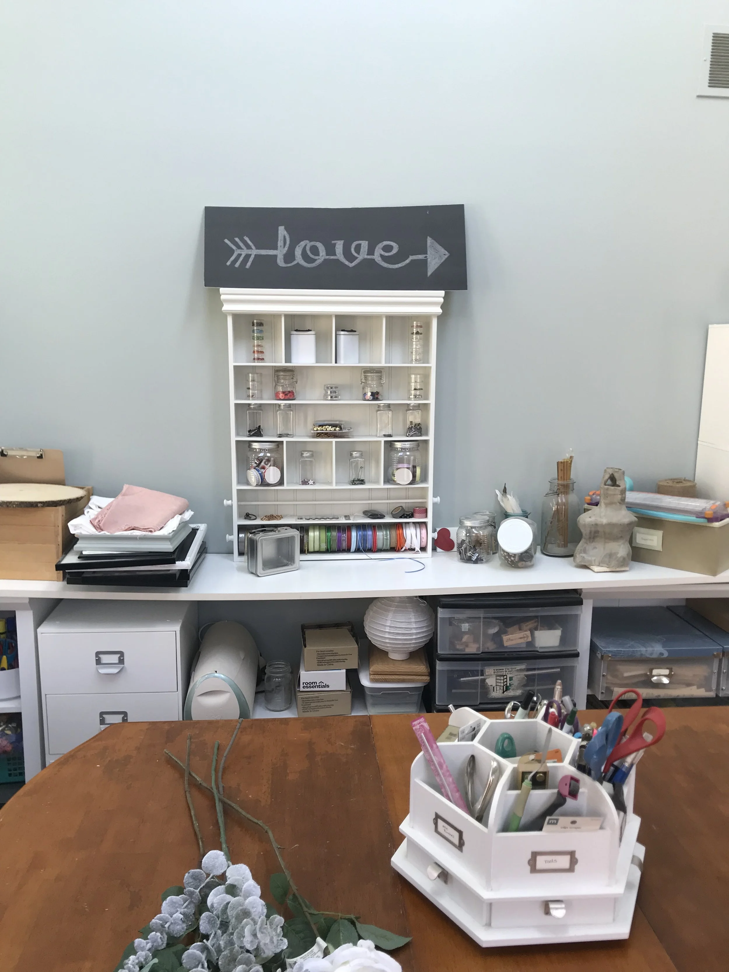
And, as a reminder, the sunroom was previously being used as a craft room but had suffered some neglect. The craft supply storage had run wild, and the robin’s egg blue paint color was never truly loved. Here are some before snaps:
Then…six weeks later…we have the final room!
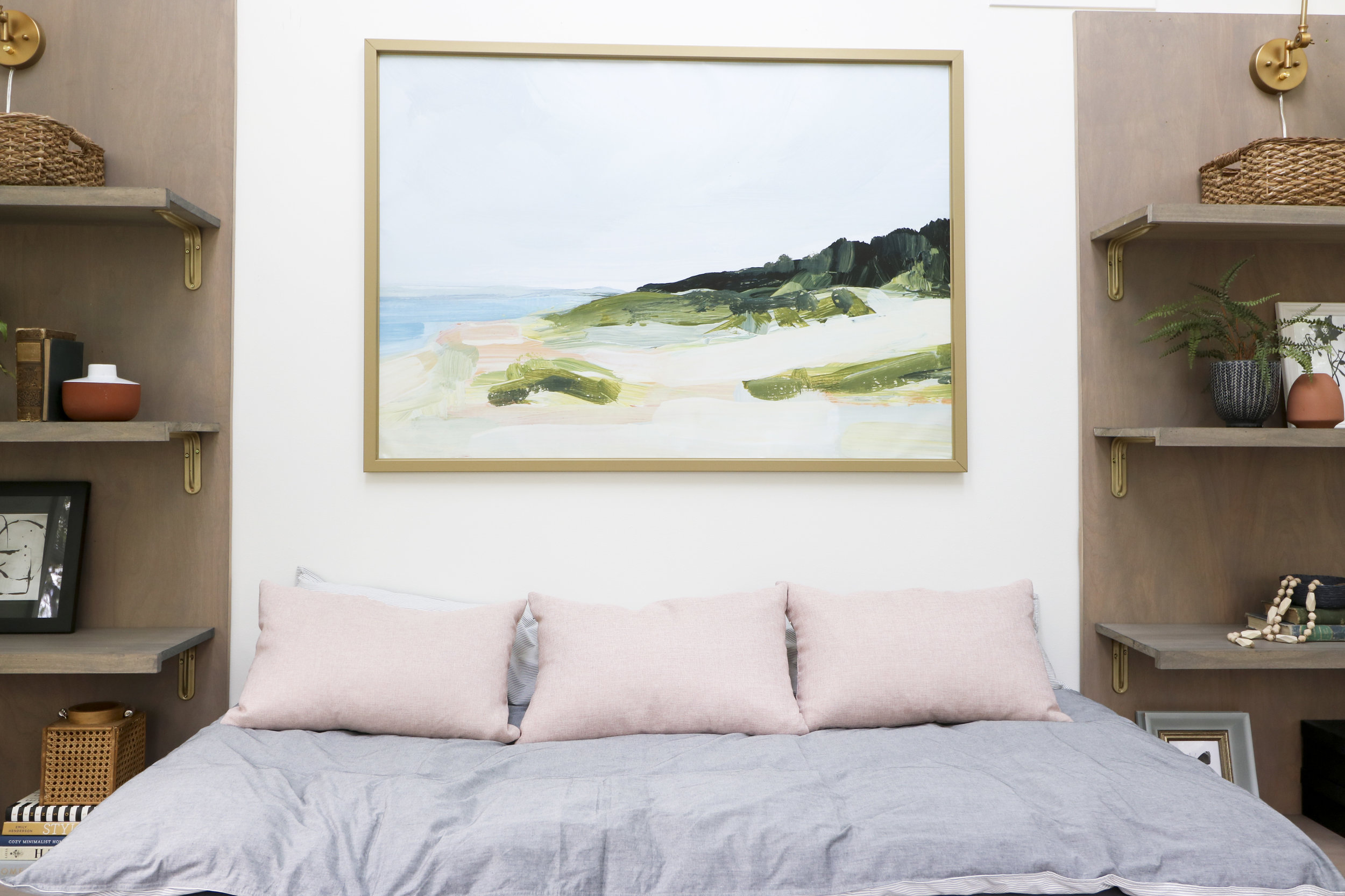
I am ready to put my feet up and read a book on that daybed! Besides a sunny spot to read, this space will serve as a main floor guest space for my mom when she visits and a place for Remi, our bernedoodle, to hang out while we are out of the house. This space is more feminine than what I usually design for our own home, but it’s a nice complement to the more masculine adjacent family room. Kylie and I stuck close to the original vision, and I love the completed design from the herringbone slate floors to the sparkly chandelier!
Daybed
The daybed is the focal point and functional piece of the room. I wanted a layered look for the daybed that was easy to take off to launder. This linen fitted sheet is the foundation. It is heavy, and I am very happy with how it looks. I used a 3-inch down alternative mattress topper for the next layer. I covered it with this duvet cover from Ikea that my wonderful friend, Vickie, altered to fit the topper. (Thanks for your help Vickie!!) Kylie and I debated on using a lot of fun pillows, but in the end decided to keep it simple with three pink pillows that we found at Home Goods.
Green Vase (McGee and Co) | White Terra Cotta Vase (Mcgee and Co) | Lantern (Hobby Lobby)
Bookcases
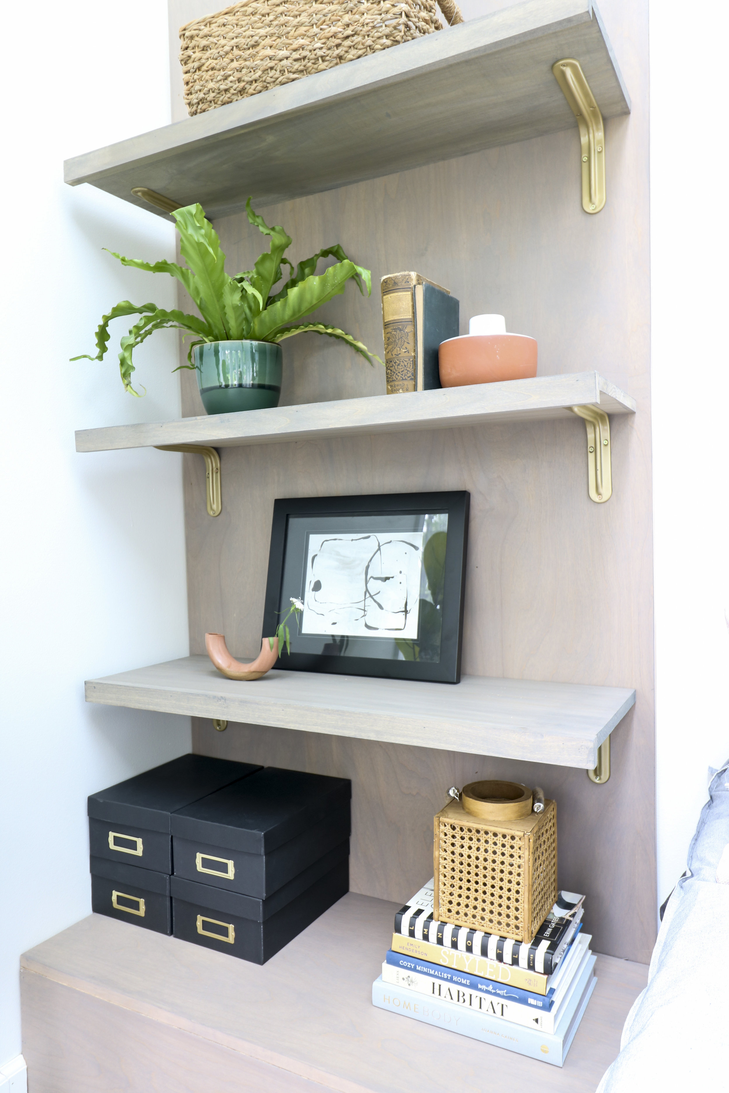
My husband and son made the bookcases that flank the bed. I wanted a modern silhouette, but the shelves needed to be deep enough to hold containers for craft storage. The bottom shelf (the box) can act as a nightstand for guest to sit a drink or charge their phones. I LOVE how these bookshelves came together!
Art | Frame (Ikea) | Pillows (Home Goods)
Giant Art
We used Jenny Komenda’s method of printing large art on matte vinyl and framing it in an Ikea canvas frame. Check out her shop, Juniper Print Shop, for great art options.
Window Treatments
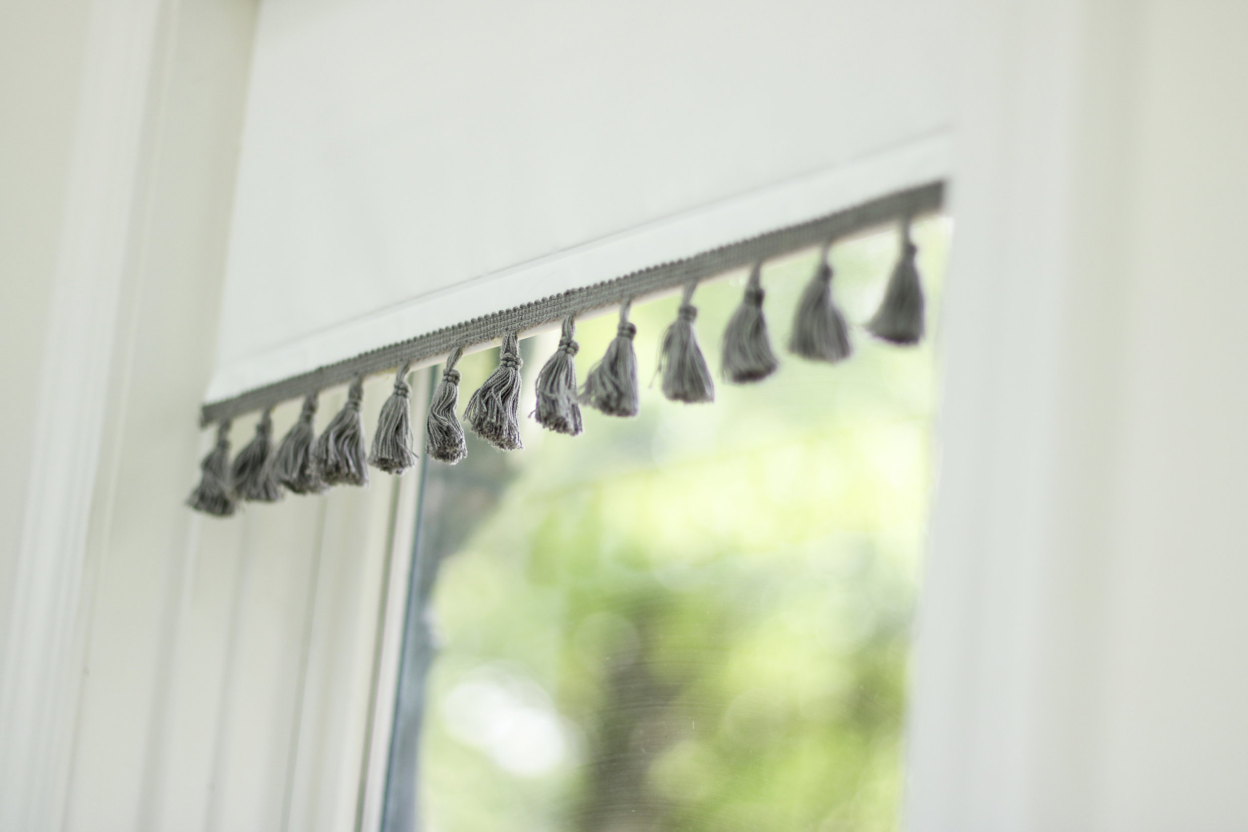
Since there are five windows in this room, we wanted to keep the window treatments simple and affordable. White blinds to the rescue! We dressed them up with some tassel trim from Joann’s Fabric. The best part: five window treatments for a total of $75.00!!
Back Corner
These art pieces bring the peach, pink, and blue to this side of the room. The chair brings texture to the space, and the perfect size if you want a chair with a smaller footprint. It fits adults perfectly well, but my two-year-old grandson has declared this chair as his.
Plant Stand (TJ Maxx)
The room got Remi’s stamp of approval. Who wouldn’t enjoy relaxing in this light-filled room?
That’s it for this round of One Room Challenge, but if you want to keep up with us make sure to follow us on Instagram! We are going to be deep diving into bookcase styling and are working on a kitchen/living room/dining room renovation.
We love participating in the ORC, so a thanks definitely goes out to Linda Weinstein from Calling It Home, the creator and owner of the event, and to Better Homes and Gardens, the media sponsor. One Room Challenge reveal week is one of the most inspiration-filled weeks of the year, so make sure you check out the 20 designers and all the guest participants!
Thanks for reading, Staci


