One Room Challenge | Week Six | Final Reveal Is Here!

Welcome! The best week of the One Room Challenge is here—it’s final reveal week!

The One Room Challenge is a bi-annual event that features 20 featured designers and many guest participants who makeover one room in six weeks. Better Homes and Gardens is the media sponsor.

This basement bathroom has come a long way! Before we delve into all the details of the reveal, here are all the steps along our journey.

Week 1 | Week 2 | Week 3 | Week 4 | Week 5

If you are new to KS Design Company, read more about us here. We are a mother-daughter design team working in Topeka and the Kansas City metro. We started our business a little over a year ago, meaning we have spent the past year having fun designing spaces and trying to keep up with the learning curve of running a new business.

The Beginnings

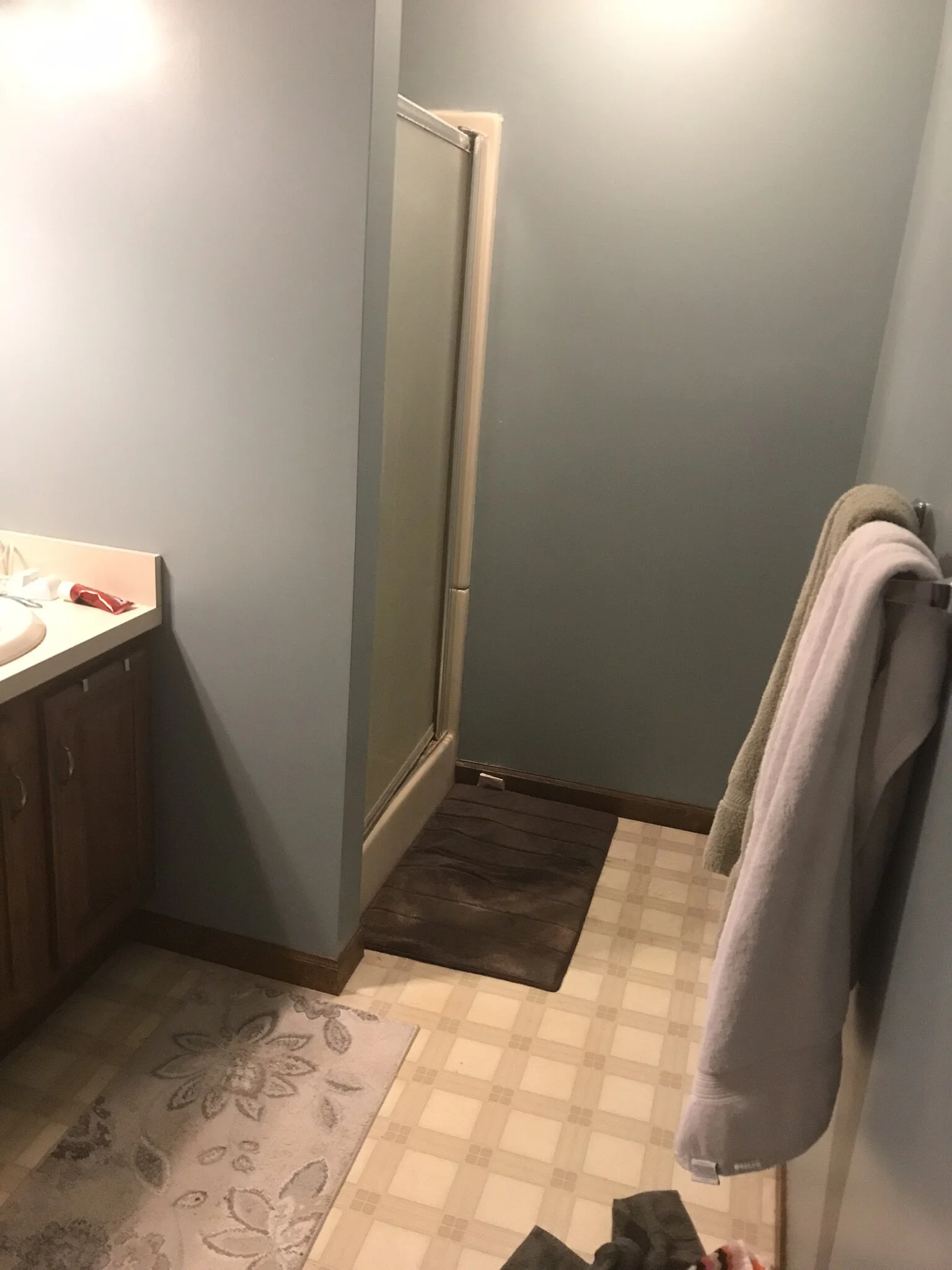
Just as a reminder, this is where we began: an outdated space that was looking a little sad.

IMG_5435.jpeg

And Now…

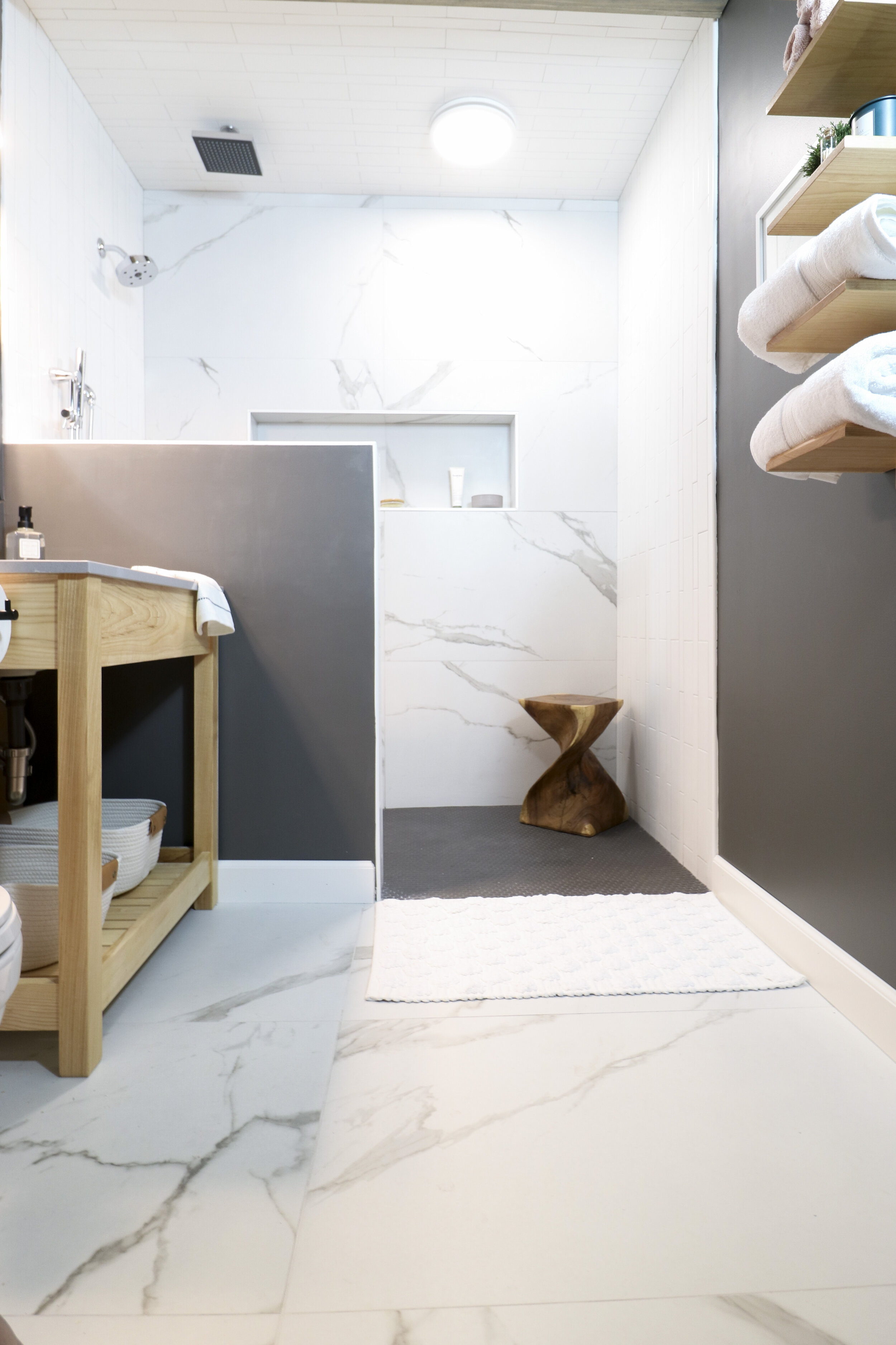
It’s a whole new bathroom! The space feels so much brighter, which was a goal since the basement bathroom has no natural light source. One of the first things decided was that the shower wall should be demoed to a half wall. This really opened up the space and made it feel more luxurious. Also, the shower was expanded to cover the whole back wall, meaning it’s twice its original size. We chose three different tiles to add visual interest, but worked to make sure the shower space still felt cohesive. Read more about the tile selection process here.

Basement Bathroom Reflection.jpg

Shower Specifics

As far as water sources, this shower has it all: a normal showerhead, a rainfall showerhead coming from the ceiling, and a sprayer. It definitely gives off some water park vibes, which was exactly the plan. One of the people using the shower regularly will be my two-year-old grandson who is a huge fan of water parks. He has already started to call it his shower. 😉

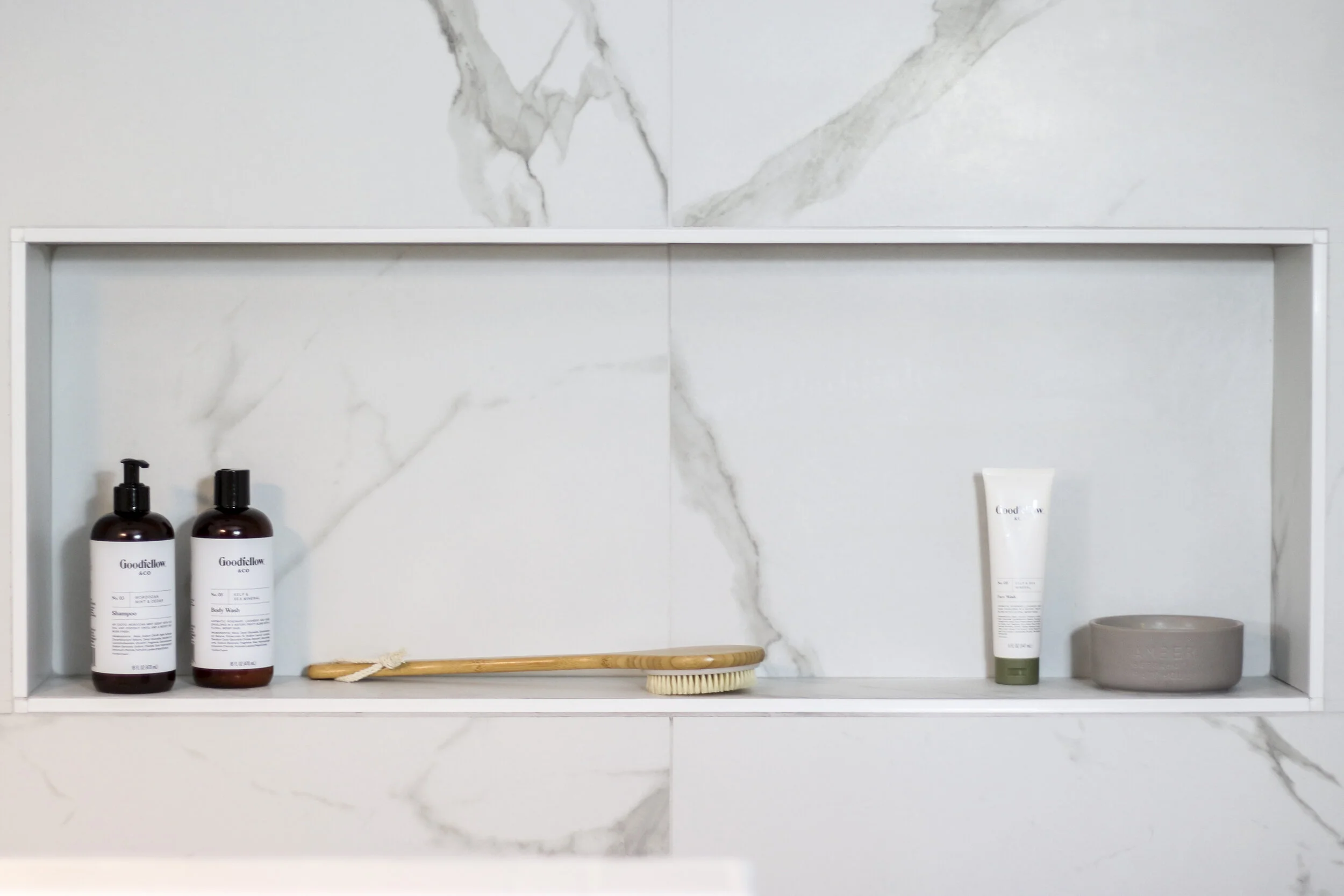
The mega-sized ledge was recessed into the shower. It probably won’t always look so lovely, but it will be the perfect size for all the toiletries and bath toys.

Stool (TJ Maxx, Similar)

Stool (TJ Maxx, Similar)

The stool was the final touch. Every shower area needs somewhere to prop up a leg for shaving. Plus, the stool added some warmth to that side of the room.

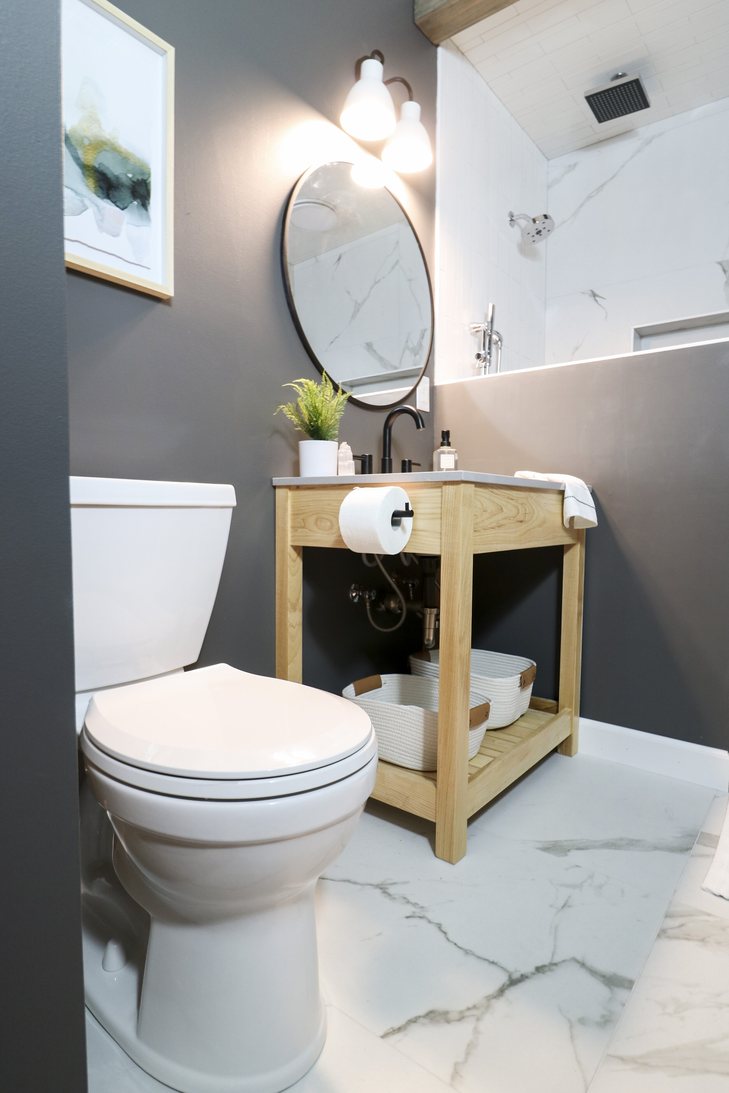
Basement Bathroom Full 2.jpg

Vanity Area

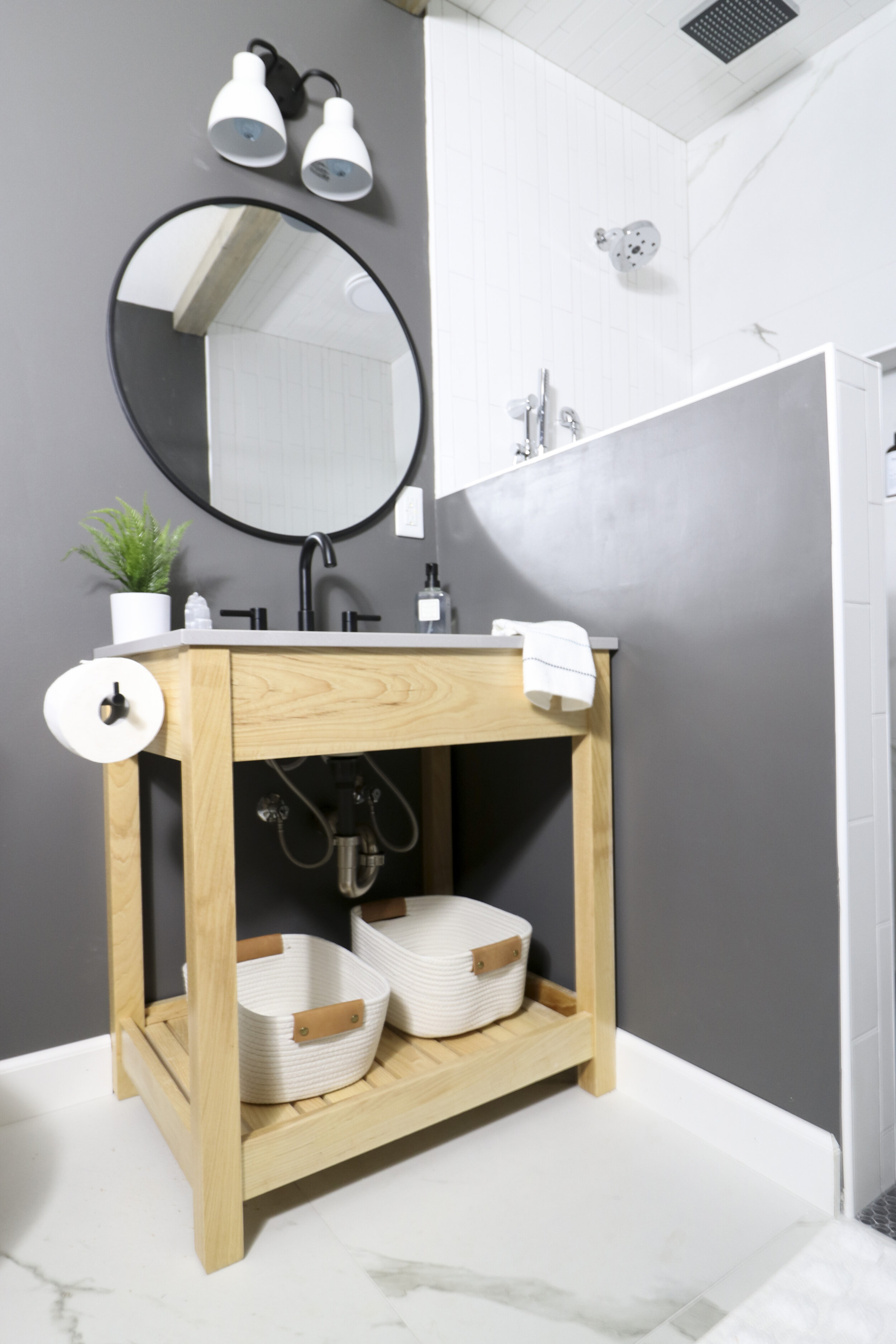
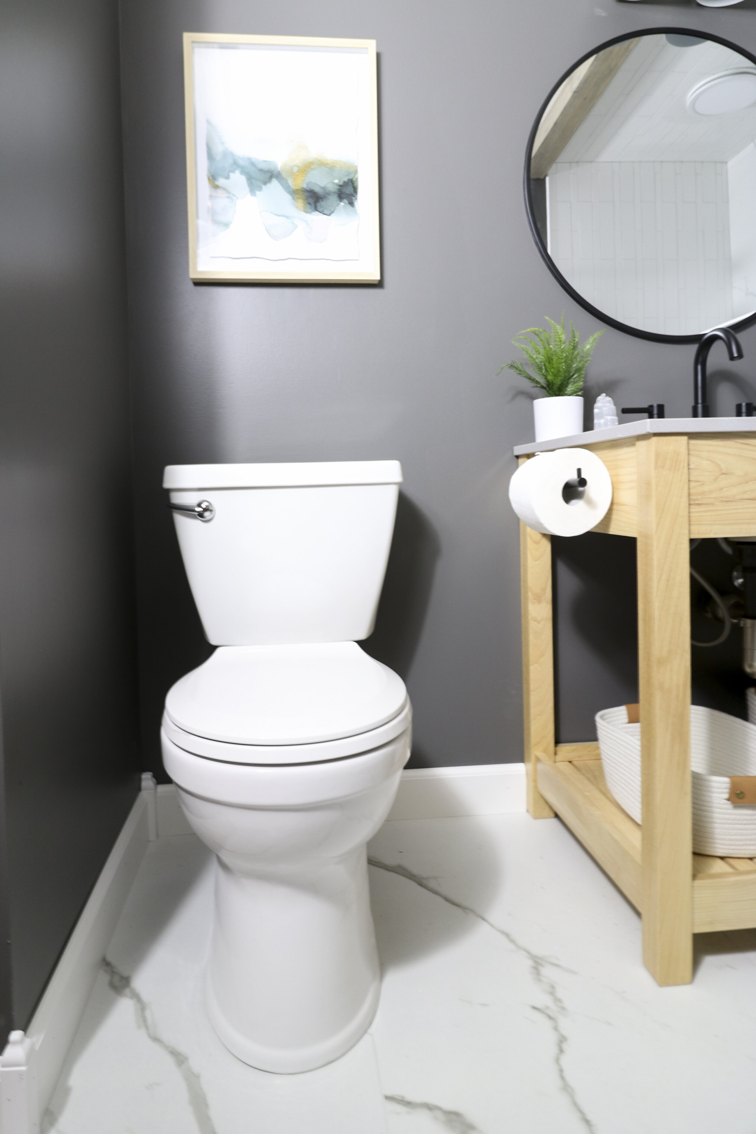
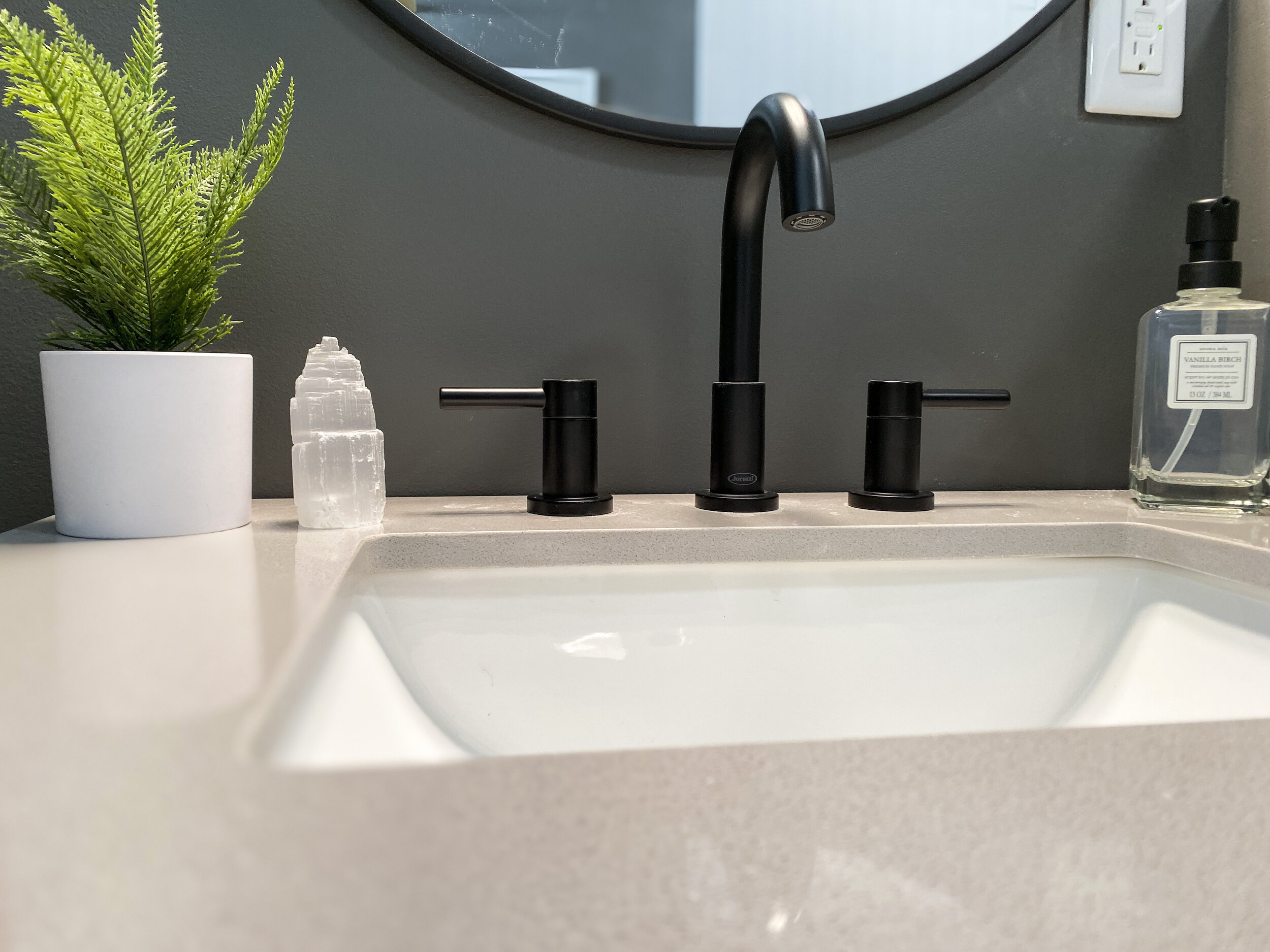
The simple, open vanity reinforces the open feeling in the bathroom, and the wood breaks up the stark surfaces. Read more about the custom-made vanity here. We love the modern style and matte black finish that the light fixture, mirror, and faucet share.

Faucet | Soap Dispenser (HomeGoods)

Faucet | Soap Dispenser (HomeGoods)

Faux Plant (TJ Maxx) | Crystal (TJ Maxx)

Faux Plant (TJ Maxx) | Crystal (TJ Maxx)

Final Touches

On the wall opposite the vanity, there is a custom-built towel rack. The clean lines and openness mirror the vanity. The beautiful line art carries that touch of black to the other side of the room.

Art | Towel Rack (custom-made by Brian at Brokenstar Woodworking) | White Towels (HomeGoods) | Pink Towels

Art | Towel Rack (custom-made by Brian at Brokenstar Woodworking) | White Towels (HomeGoods) | Pink Towels

Basement Bathroom Towel Rack Straight.jpg
Basement Bathroom Beams.jpg

We knew the bathroom needed one more touch of oomph, so we DIYed two wooden beams for the ceiling. The DIY ended up being a family affair with my husband and son doing the hard work—thanks for the help Lance and Keenan!

Signs (Hobby Lobby)

Signs (Hobby Lobby)

Finally, these leather and iron signs hang on the far wall and greet you as you walk out the door.

Whew! We went into this One Room Challenge with the mantra “third times a charm,” and this one has may have been the most difficult yet. 😝 (Here is our final reveal from our first ORC room and our second). All the work pays off though. We are in love the final result!

The best way to keep up with us is to follow us on Instagram! We would love to hear from you there.

We think the ORC is pretty great, so a big thank you to Linda Weinstein from Calling It Home, the creator and owner of the event, and to Better Homes and Gardens, the media sponsor. One Room Challenge reveal week is full of eye candy, so make sure you check out the 20 designers and all the guest participants!

Thanks for stopping by,

Staci and Kylie

ORC-Guest-400x218.png

One Room Challenge | Week Five | Setbacks Near The End

Five weeks are in the books, and that means there is one final week in the One Room Challenge to wrap everything up in this basement bathroom. All the plans are in place to finish, but there have been some setbacks this week, which make it more difficult to see it all coming together in so little time.

Last week, we painted the walls a charcoal gray, which helped add a little life to the space (especially compared to the white we initially painted them!). This week was supposed to be all about installing everything, but there have been some hold ups.

The Vanity

Focusing on the good first, the vanity is finished! My neighbor, Brian, owns a woodworking studio called Brokenstar Woodworking and does incredible work. From the start, we knew that a simple wood vanity was the way to go and really liked the Easton Single Sink Vanity from Pottery Barn but did not like the price tag. Brian said he was up for building a vanity, and we are so thankful because his work is such great quality. We opted for Ash wood with a clear sealant.

Basement Bathroom Vanity.jpg

Don’t you like how the wood pops off the dark walls? Next up was deciding what color of countertop would work best: white, lighter gray, or darker gray? White would stand out against the walls and darker gray would blend into the walls—both good options—but after taking in a paint swatch of the wall color, we chose the lighter gray (this one specifically).

The Trim

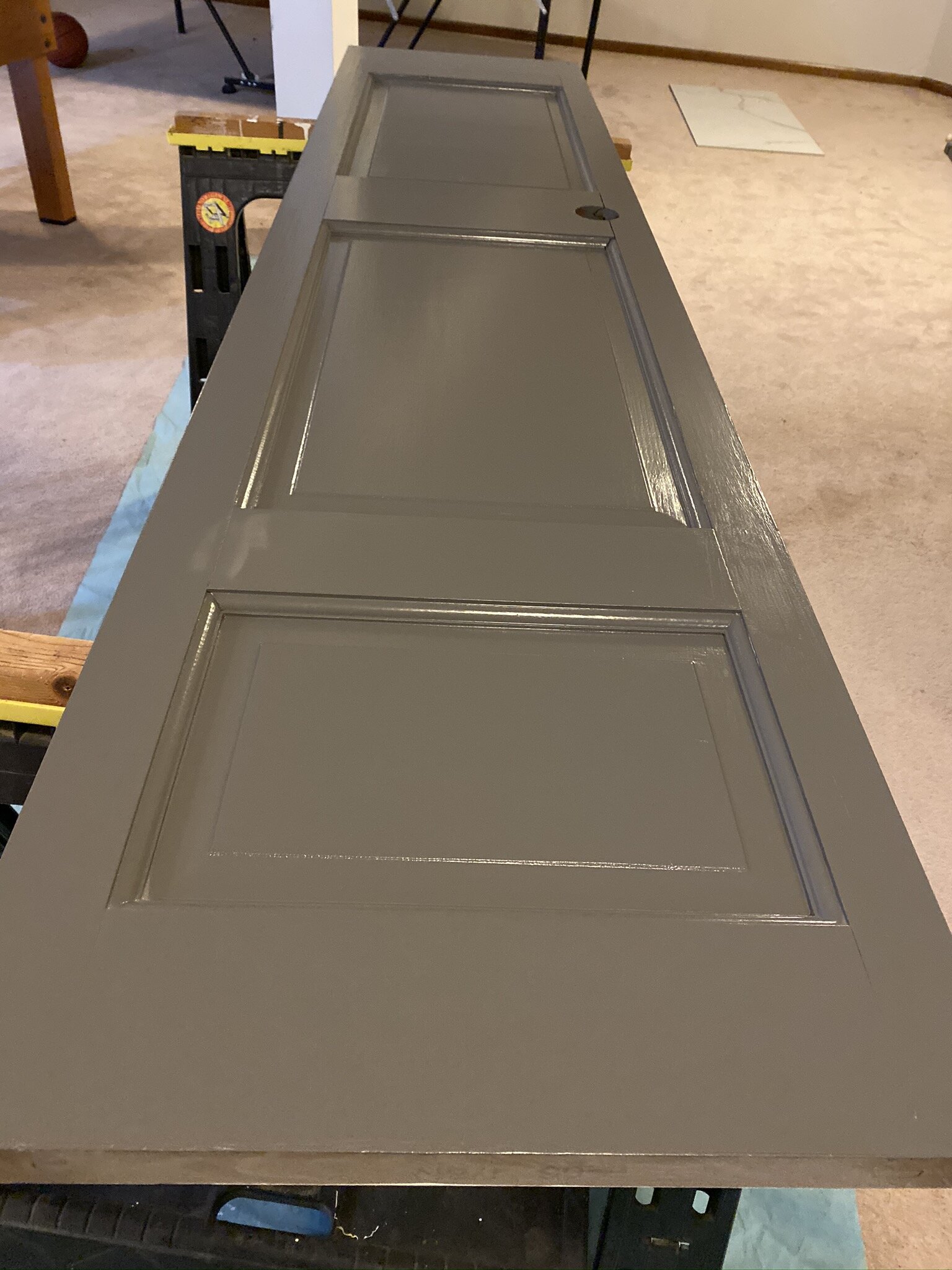
The wood trim also was painted this week—one more thing to check off the list! The wood tone of the trim didn’t go with the wood tone of the vanity, so the trim got a couple coats of paint in the same color as the walls (except in semigloss). Now, the trim blends in with the rest of space, and since we didn’t want the trim to be a focal point, it works well.

Basement Bathroom Door Before.JPEG
Basement Bathroom Door.jpeg
Basement Bathroom Under Construction.jpeg

A Few Setbacks

Full disclosure, the bathroom currently looks like we have regressed in our progress. 😂

The popcorn ceiling was scraped at the beginning of the project but repairs were required on the knockdown that was applied. That paired with a sick contractor has delayed the installation of the light fixture, the countertop, and the mirror. But what would the ORC be without some minor delays?

Here is our to-do list that we will be updating weekly. Italics mean the task is partially completed.

  • Demo bathroom
  • Source and install tile
  • Install new vanity or repurpose old one
  • Source and install light fixture
  • DIY ceiling beams
  • Install glass for shower
  • Source mirror
  • Source rug
  • Paint walls and trim
  • Source art

We will still have our big room reveal next week though, and it will be a big improvement over the room’s current condition! (Fingers crossed). Everyone else is nearing that finish line too, so make sure to head over the ORC blog.

See you next week,

Staci and Kylie
ORC-Guest-400x218.png

One Room Challenge | Week One | Basement Bathroom Before

We are gearing up for our third go at the One Room Challenge! This fall we will be tackling an outdated—dare I say ugly?—basement bathroom. Although we only have the before pictures today, the plans are already underway, and we can’t wait to reveal a new look for the bathroom in six short weeks. If you are unfamiliar with the One Room Challenge, here is the lowdown: The One Room Challenge is a bi-annual event that features 20 featured designers and many guest participants who makeover one room in six weeks. Better Homes and Gardens is the media sponsor.

If you are new to KS Design Company, welcome! We are a mother-daughter design team working in Topeka and the Kansas City metro. We started KS Design Company a little over a year ago and completed our first One Room Challenge last fall and our second last spring.

The basement bathroom: a sad place.

Basement Bathroom Before.jpeg

This bathroom needs some love and attention. After moving into our house 16 years ago, this bathroom has been heavily used, but as far as design goes, it hasn’t really been touched (beyond paint and a light fixture upon moving in). The brown/cream linoleum, the shower insert, and the laminate vanity countertop have lived their best lives, but it’s time for them to go. The plan is to revamp the space from top to bottom.

What do we have in store?

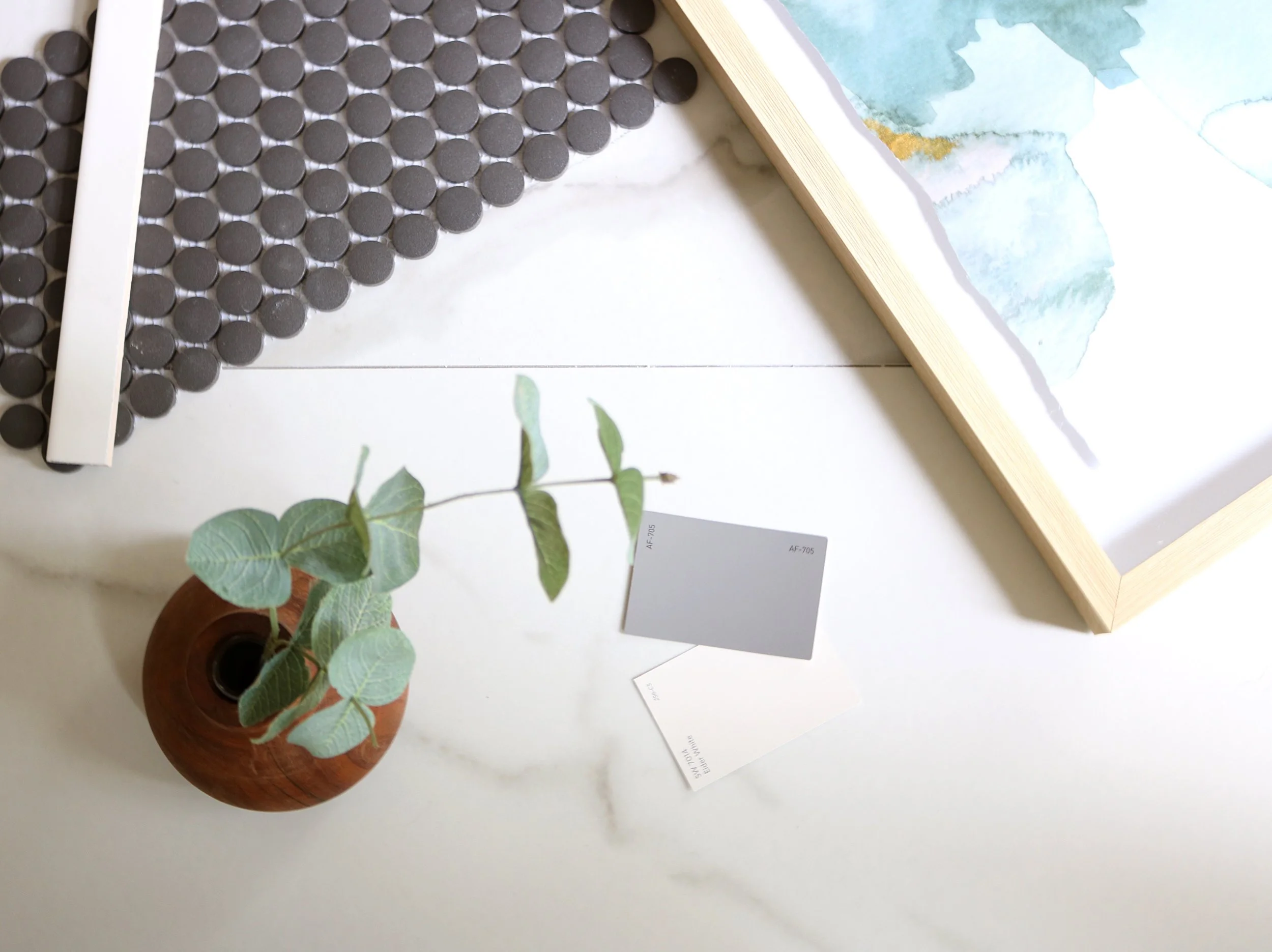
We will get into the details of the design plan next week, but the overall aesthetic for the bathroom will be modern with touches of rustic. Think large format marble-look porcelain tile for that modern feel. Then wood elements with a new (or potentially heavily repurposed?) vanity and new ceiling beams will bring some warmth. Here’s a sneak peek.

Basement Bathroom Flatlay.jpg

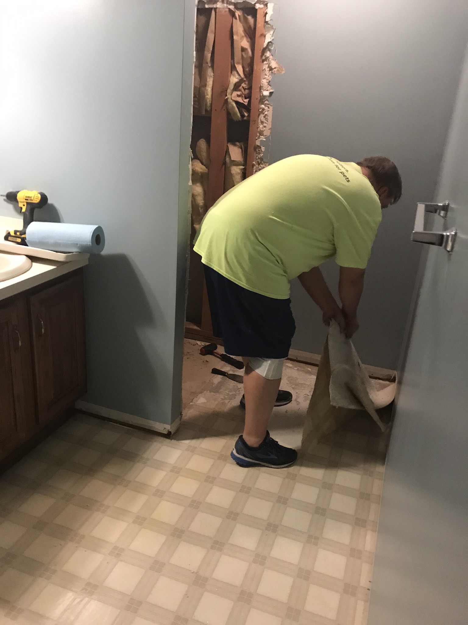
Because this space is getting a head to toe makeover, demolition has begun.

Basement Bathroom Demolition.JPEG
Basement Bathroom Demolition 2.JPEG

Already on the way to transformation! Join us next week to see more progress. And, in the meantime, check out all the creativity over at the One Room Challenge blog.

To keep us accountable, here is our to-do list that we will be updating weekly. Italics mean the task is partially completed.

  • Demo bathroom
  • Source and install tile
  • Install new vanity or repurpose old one
  • Source and install light fixture
  • DIY ceiling beams
  • Install glass for shower
  • Source mirror
  • Source rug
  • Paint walls and trim
  • Source art

See you next week,

Staci and Kylie

ORC-Guest-400x218.png

One Room Challenge | Week Six | Sunroom Final Reveal

Final reveal day is here for The One Room Challenge! We worked up to the last minute on the sunroom—why take pictures ahead of time, when you can take them the day before?—but it is all the things a sunroom should be: light, bright, and comfortable. All in all, it’s lovely.

If you are coming from ORC and new to KS Design Company, welcome! We are a mother-daughter design team working in Topeka and the Kansas City metro. We started KS Design Company last summer and completed our first One Room Challenge last fall.

Sunroom Doors Closed.jpg

With Instagram, it’s so easy to only appreciate a beautiful end result. But, of course, there’s a lot beauty in the process too. That’s one of our favorite aspects of The One Room Challenge: the focus on the journey to the final design. If you’re interested in our journey, make sure to start at the beginning of the sunroom posts.

Week 1 | Week 2 | Week 3 | Week 4 | Week 5

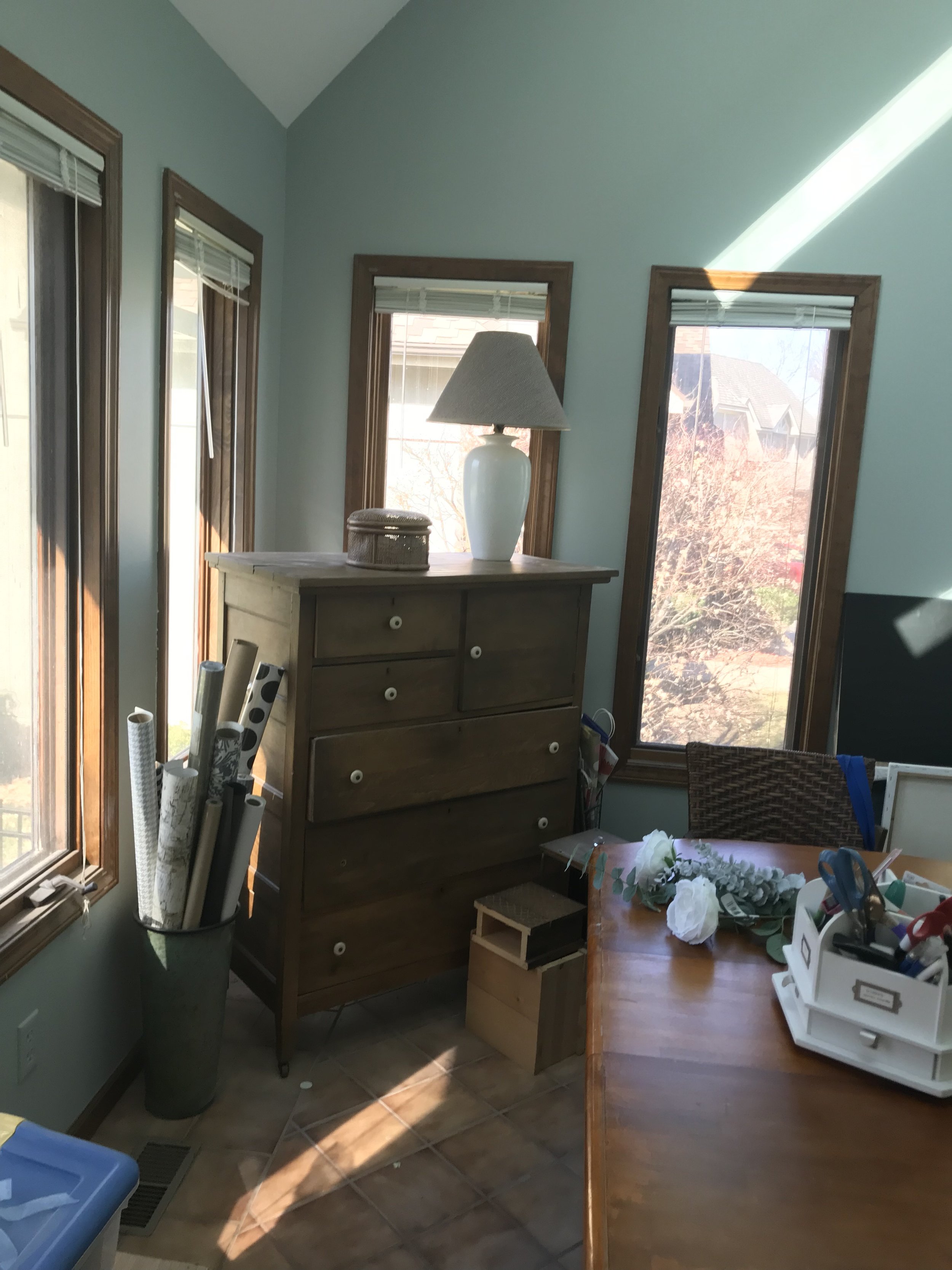
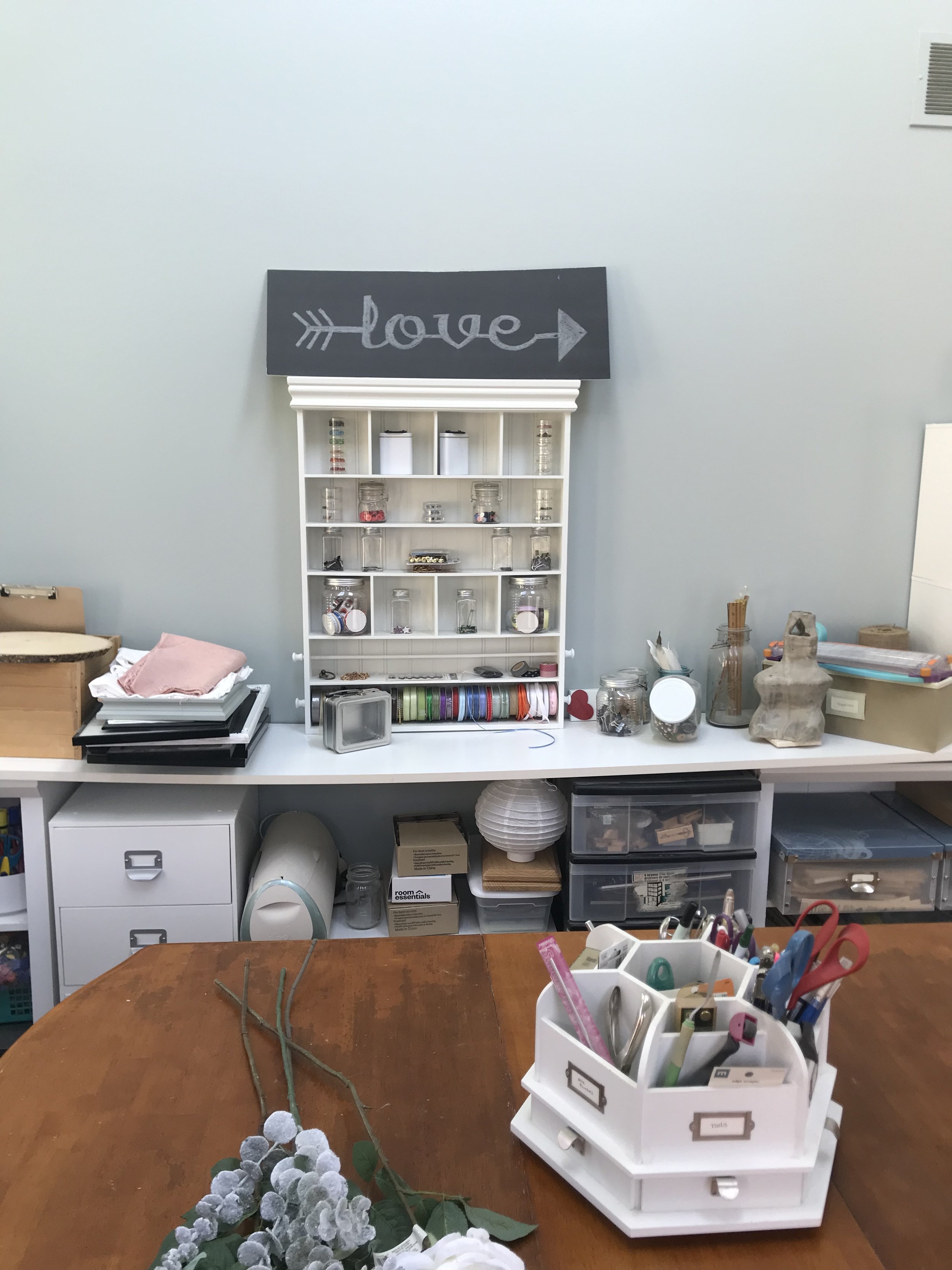
And, as a reminder, the sunroom was previously being used as a craft room but had suffered some neglect. The craft supply storage had run wild, and the robin’s egg blue paint color was never truly loved. Here are some before snaps:

Sunroom Before 2
Sunroom Before 1.jpg
Sunroom Before 3

Then…six weeks later…we have the final room!

Full Sunroom.jpg

I am ready to put my feet up and read a book on that daybed! Besides a sunny spot to read, this space will serve as a main floor guest space for my mom when she visits and a place for Remi, our bernedoodle, to hang out while we are out of the house. This space is more feminine than what I usually design for our own home, but it’s a nice complement to the more masculine adjacent family room. Kylie and I stuck close to the original vision, and I love the completed design from the herringbone slate floors to the sparkly chandelier!

Sunroom Daybed Straight.jpg

Daybed

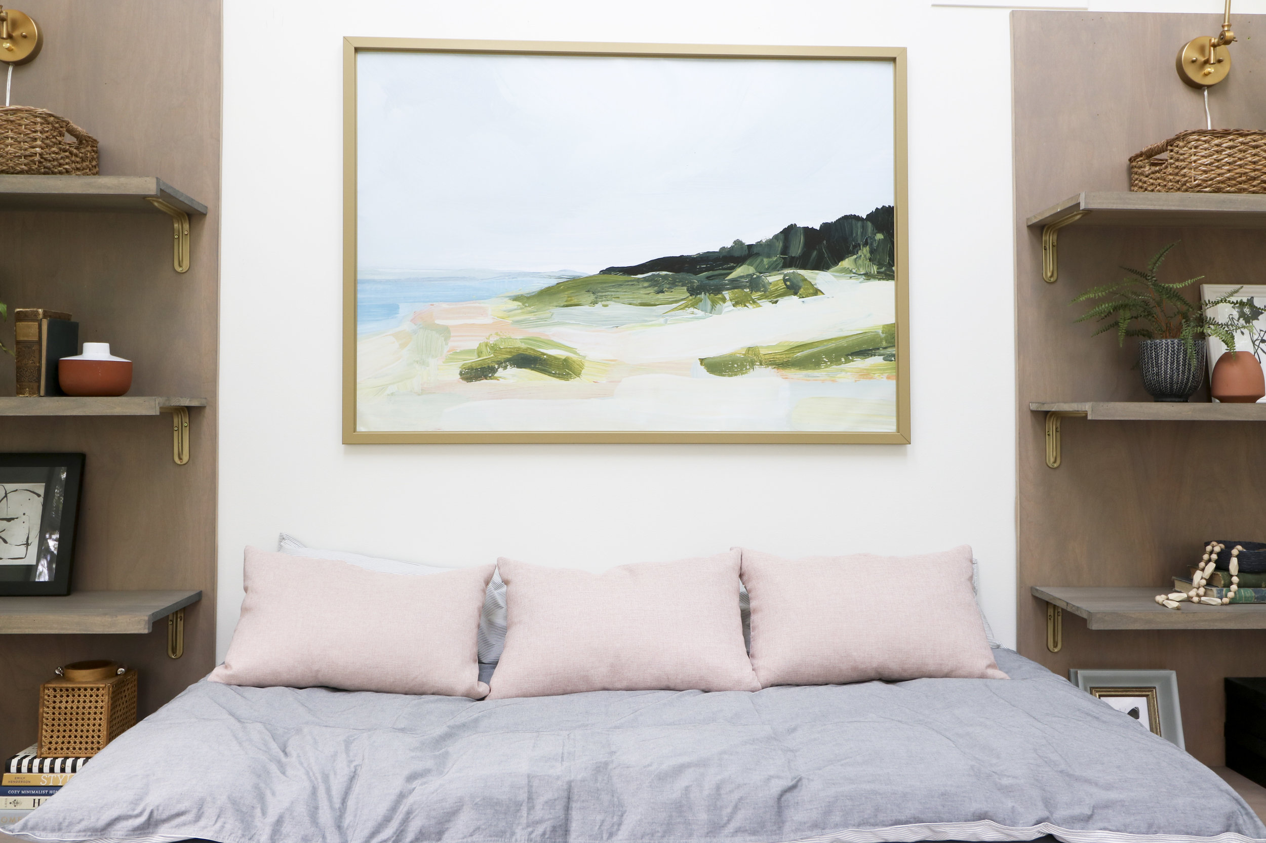
The daybed is the focal point and functional piece of the room. I wanted a layered look for the daybed that was easy to take off to launder. This linen fitted sheet is the foundation. It is heavy, and I am very happy with how it looks. I used a 3-inch down alternative mattress topper for the next layer. I covered it with this duvet cover from Ikea that my wonderful friend, Vickie, altered to fit the topper. (Thanks for your help Vickie!!) Kylie and I debated on using a lot of fun pillows, but in the end decided to keep it simple with three pink pillows that we found at Home Goods.

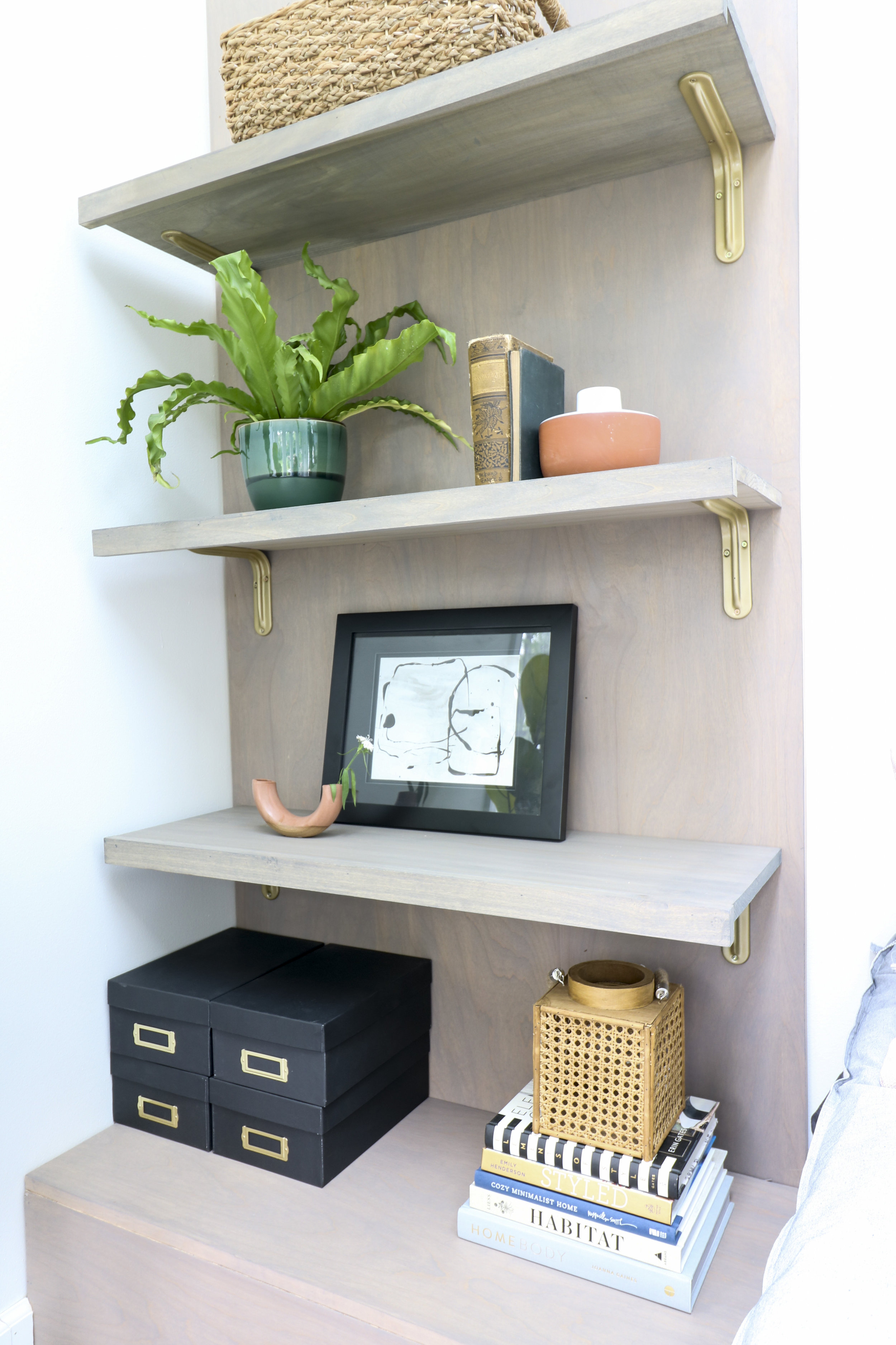
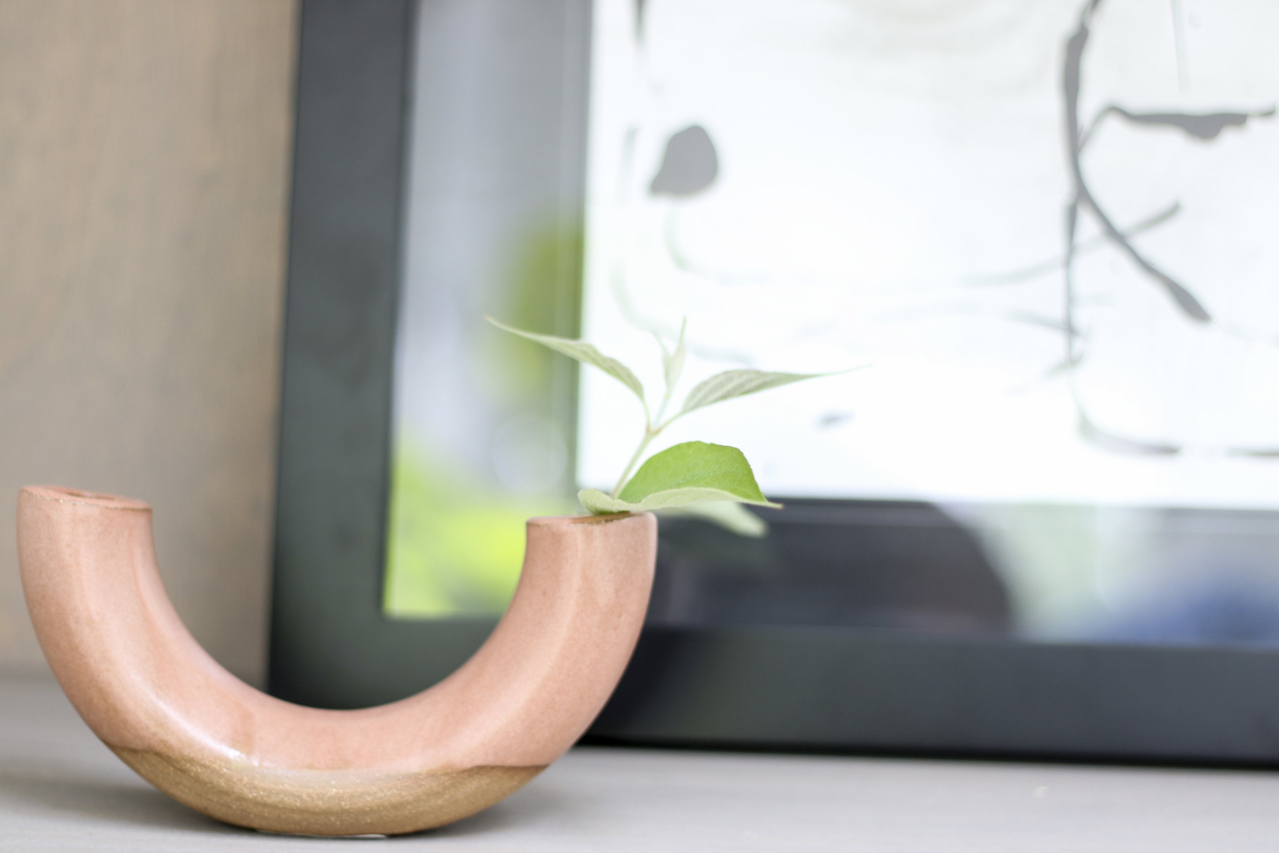
Green Vase (McGee and Co) | White Terra Cotta Vase (Mcgee and Co) | Lantern (Hobby Lobby)

Green Vase (McGee and Co) | White Terra Cotta Vase (Mcgee and Co) | Lantern (Hobby Lobby)

Bookcases

My husband and son made the bookcases that flank the bed. I wanted a modern silhouette, but the shelves needed to be deep enough to hold containers for craft storage. The bottom shelf (the box) can act as a nightstand for guest to sit a drink or charge their phones. I LOVE how these bookshelves came together!

Bowl | Wooden Beads (Joann’s Fabric)

Bowl | Wooden Beads (Joann’s Fabric)

Art
Art | Frame (Ikea) | Pillows (Home Goods)

Art | Frame (Ikea) | Pillows (Home Goods)

Giant Art

We used Jenny Komenda’s method of printing large art on matte vinyl and framing it in an Ikea canvas frame. Check out her shop, Juniper Print Shop, for great art options.

Window Treatments

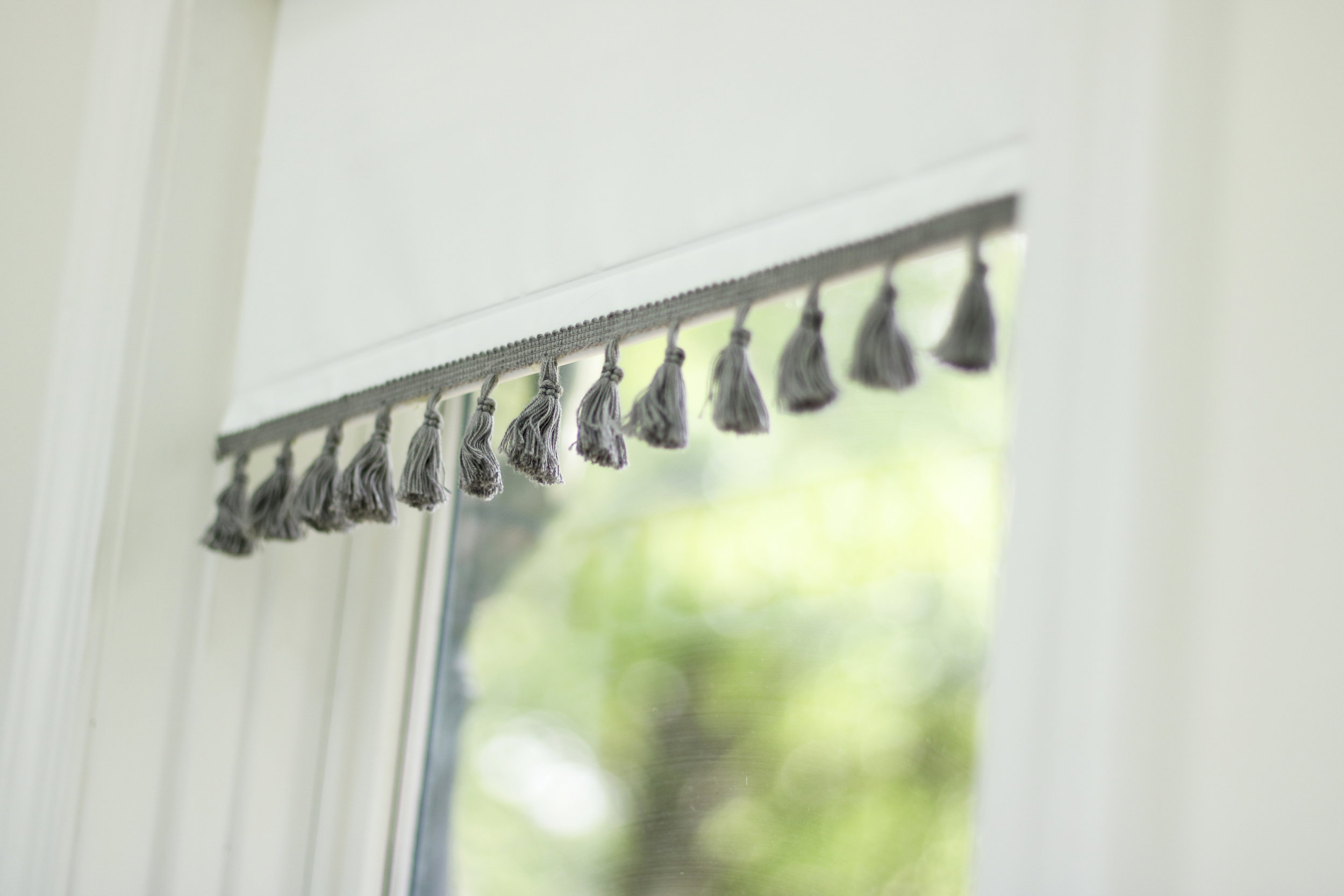
Since there are five windows in this room, we wanted to keep the window treatments simple and affordable. White blinds to the rescue! We dressed them up with some tassel trim from Joann’s Fabric. The best part: five window treatments for a total of $75.00!!

Back Corner

These art pieces bring the peach, pink, and blue to this side of the room. The chair brings texture to the space, and the perfect size if you want a chair with a smaller footprint. It fits adults perfectly well, but my two-year-old grandson has declared this chair as his.

Plant Stand (TJ Maxx)

Plant Stand (TJ Maxx)

The room got Remi’s stamp of approval. Who wouldn’t enjoy relaxing in this light-filled room?

That’s it for this round of One Room Challenge, but if you want to keep up with us make sure to follow us on Instagram! We are going to be deep diving into bookcase styling and are working on a kitchen/living room/dining room renovation.

We love participating in the ORC, so a thanks definitely goes out to Linda Weinstein from Calling It Home, the creator and owner of the event, and to Better Homes and Gardens, the media sponsor. One Room Challenge reveal week is one of the most inspiration-filled weeks of the year, so make sure you check out the 20 designers and all the guest participants!

Thanks for reading, Staci

ORC-Guest-400x218.png

One Room Challenge | Week Five | Putting It Together

T-minus one week until the sunroom reveal! We officially wrapped Week Five of The One Room Challenge. The sunroom is currently a hot mess (photographic evidence below 👇), but all those cardboard boxes contained some good stuff. This final week will be all about bringing the elements together. We are so excited to see this room go from neglected to purposeful!

Sunroom Boxes.jpg

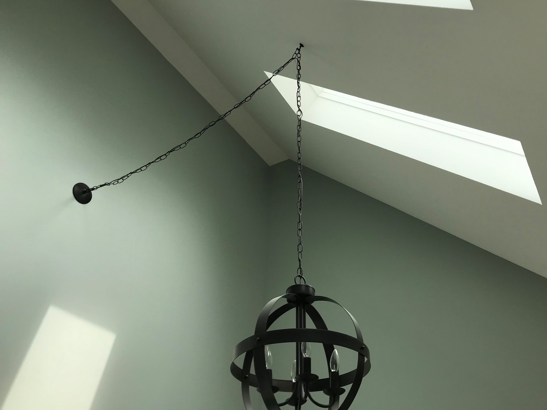
We took care of some of the more tedious tasks this week: printing artwork, assembling furniture, staining shelves. Not the most photo-worthy of projects, but necessary. Here is a sneak peak of the overhead lighting after it was assembled. Kylie’s thumb suffered from attaching all those crystals by hand, but when it’s hanging from the ceiling, it will add the perfect touch of sparkle to the light-filled sunroom.✨

Overhead Lighting.JPG

A 10-Minute Pillow DIY

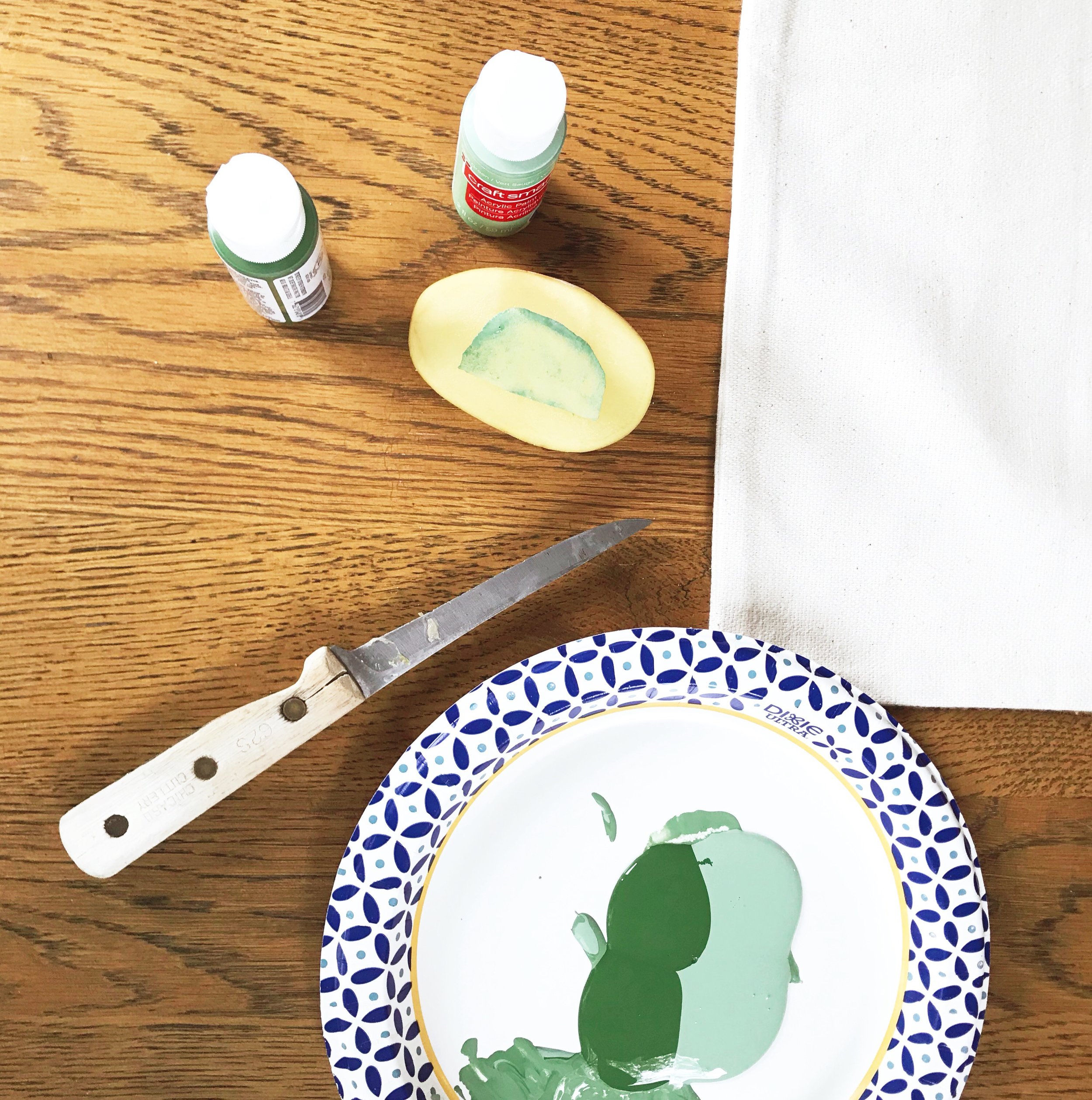
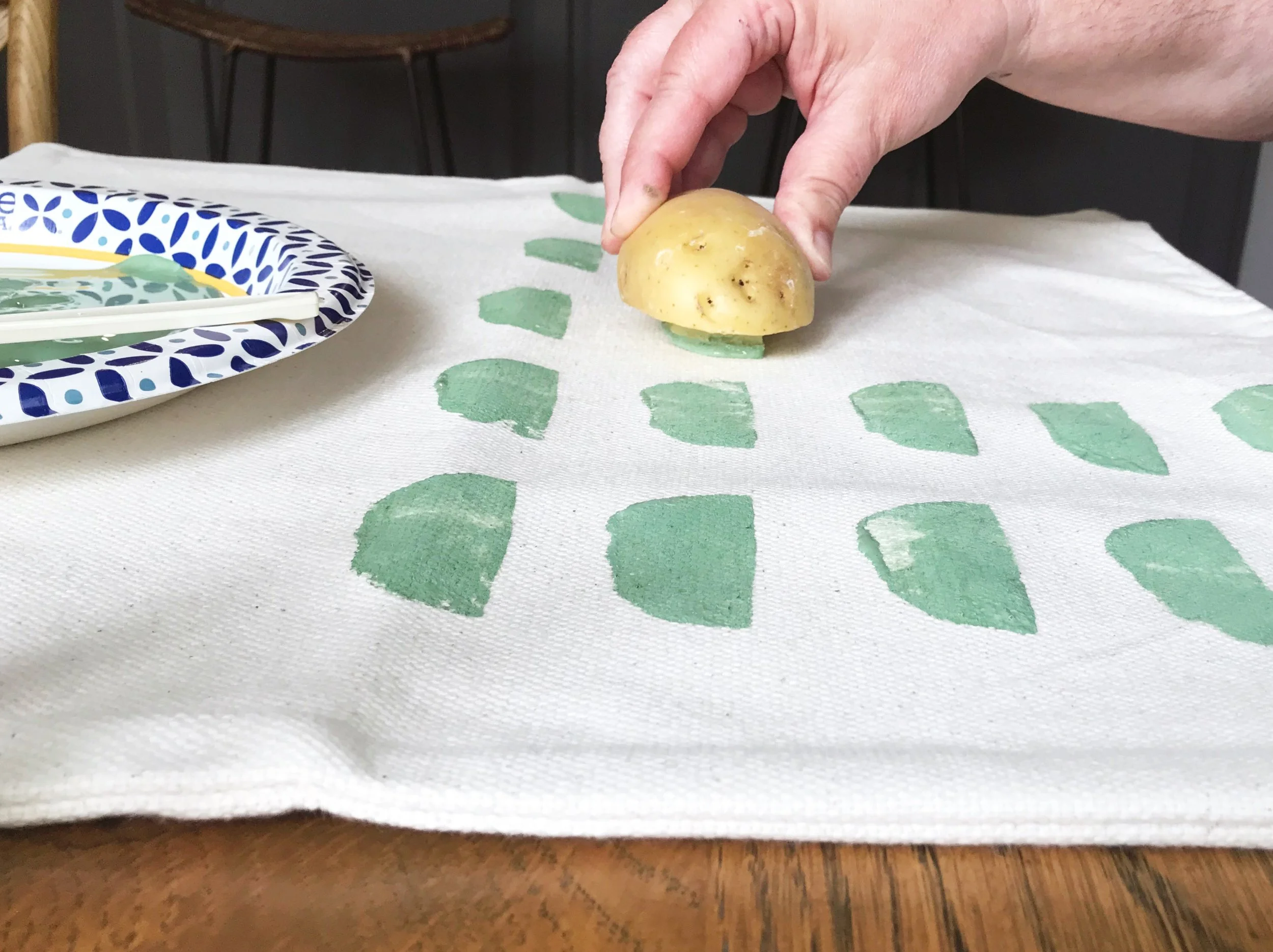
I saw this pillow, fell in love, and thought it would be an awesome DIY project. First, I ordered this beige pillow from H&M. If you haven’t checked out H&M’s home section, go give it a look. They have some amazing items—I especially like their pillow covers—at great price points. Next, Kylie and I carved a half moon shape out of a potato. I’ll be the first to admit our knife skills could use some work!! To complete the project, we mixed two colors of craft paint to get the shade we wanted, and started stamping. It was a super simple DIY, and I love the outcome! Check out the final result next week!
Potato Stamp Carving
Potato Stamp Pillow Flat Lay.jpg
Potato Stamp Pillow DIY.jpg

Here is the updated to-do list. All tasks are now at least in process, and two-thirds have been completed! The finish line is in sight.

The to-do list. Italics=partially completed.

  • Source tile
  • Install tile
  • Paint window frames white
  • Paint room
  • Paint and install new baseboards
  • Source and order lighting
  • Source and order art
  • Build bookcases
  • Build daybed frame
  • Order caning
  • Make daybed cushion cover
  • Sew and purchase pillow covers
  • Install lighting
  • Decide on table top
  • Source seating for table
  • Buy greenery and plants
  • Source accessories
  • Source window treatments

You won’t want to miss the final reveal next week. The best week of The One Room Challenge, for sure. In the meantime, make sure to visit the other guest participants and cheer them on!

Until Next Thursday, Staci

ORC-Guest-400x218.png

One Room Challenge | Week Four | Bookcases and Bistro Table

Welcome to Week Four of The One Room Challenge! The big news this week is that the main furniture of the room is in progress. Last weekend, my husband, Lance, broke out the power tools to get the bookcases built, and I broke out the stain to try and get them installation ready.

Bookcase Inspiration

We could have gone with traditional bookcases flanking the daybed. I pinned several DIY plans that would have been beautiful, but I really wanted something with a modern feel in this space. I saw this black bookcase and the wheels started turning. What if we attached plywood to the wall and used shelf brackets to hold the shelves? Could be cool, right? I also loved this image, so I incorporated a box to the bottom of the plywood. The shelves will be 12 inches deep to hold storage boxes and the box on the bottom will be 18 inches. The trick was transferring the vision from my brain to Lance’s engineering brain. Shouldn’t he just know what I want? 😉 We are in the process, but not finished yet. We are taking a few days off to get ready for a couple’s shower we are hosting this weekend. Crazy, I know! What was I thinking to do this in the middle of the ORC?

Bookshelf Installation.jpg

Staining Issues

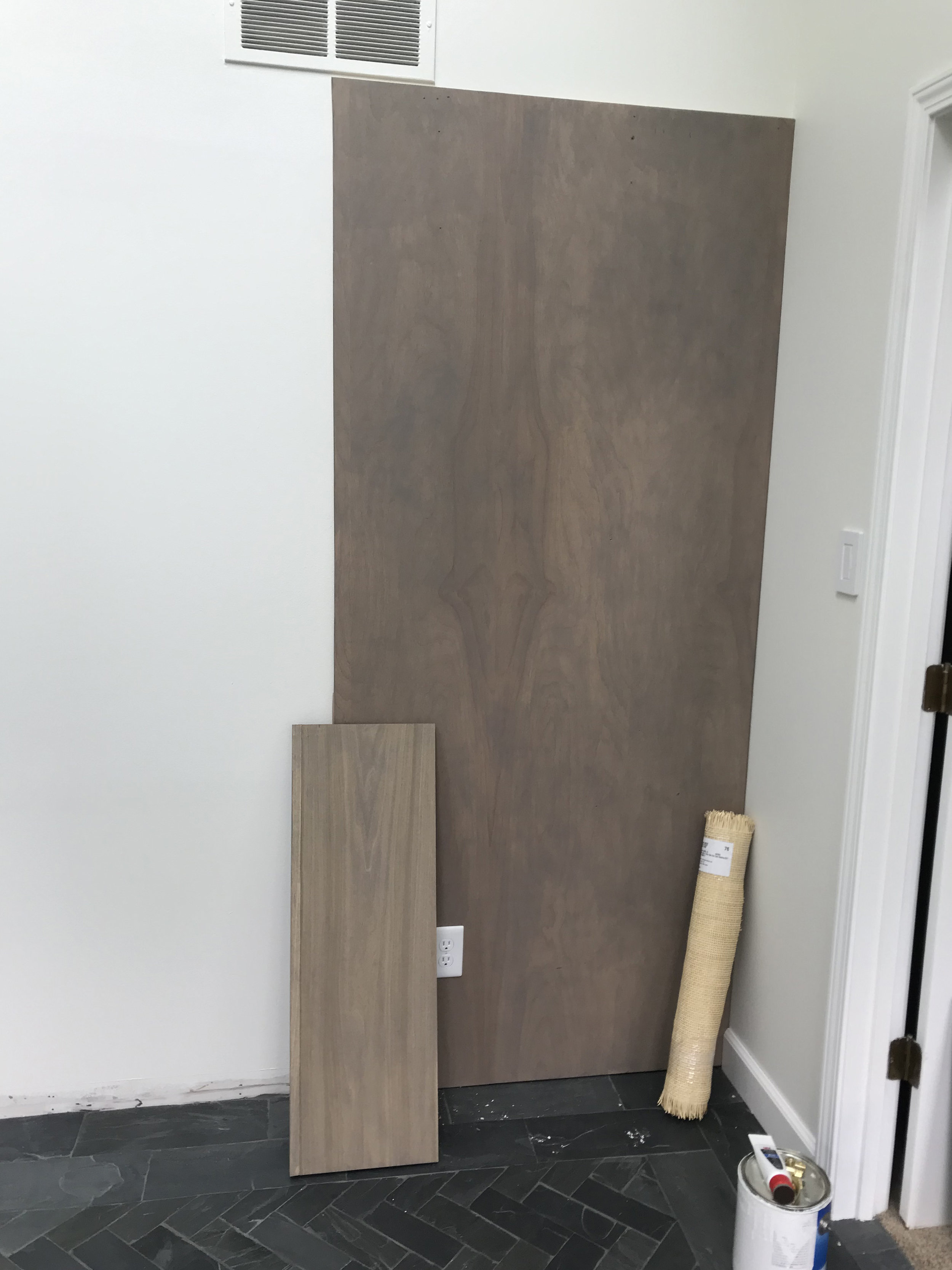
No One Room Challenge is completed without some hiccups. We wanted the bookcases stained for warmth. When we went to get the wood, they had birch plywood but not birch boards. We had to go with poplar boards. Here is the current state of things. The backing board stained darker, while the shelves stained lighter. And the roll of caning is even lighter. The caning will be used in the daybed headboard (the bookcases will be flanking either side of the daybed). I will be trying different options to try to even out the stain color. Wish me luck! If you have any ideas please leave them in the comments.

Bookshelf Stain.jpg

If I can’t work a miracle on the stain, the paint brushes will make an appearance! We can either paint the back and leave the shelves stained, or paint the whole thing. I’m keeping a positive attitude that it will all work out!!

Bistro Table Corner

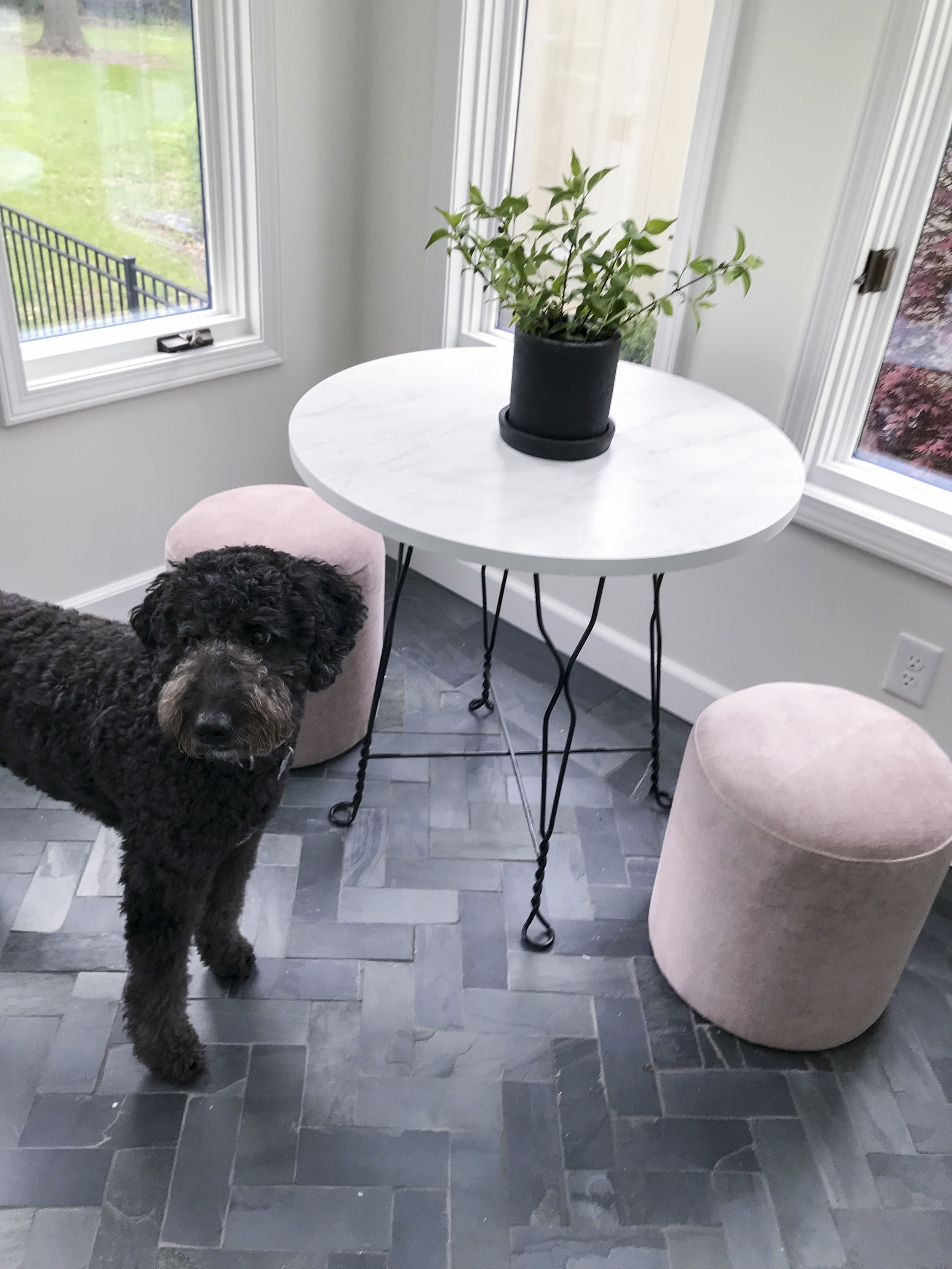
One corner of the room is almost complete. 🙌 Can you believe two different tables were patched together to create this adorable bistro table? The base came from an ice cream parlor table that Lance bought at an antique auction over 30 years ago. It has had many lives in our homes since then. A couple of years ago, the wood top broke. I thought it would be a perfect size for this space and would look really good with a marble top. Tap the brakes! Buying a 30-inch marble top was out of the budget. I found a 36-inch marble piece at a tile shop, but as it turns out, you had to buy a whole pallet. I didn’t need 22 large square pieces of marble! I took a chance and ordered a faux marble 30 inch coffee table to see if it would work. Bingo! Screwed right on, was in budget, and looks really good. Remi approves!

Bistro Table.jpg

The stools are from West Elm, and I got them on sale for a great price. I love the dusty pink rough velvet. There will be a wall lamp between the two windows. Here is a close-up of the table top. Not too shabby for a marble alternative!

Bistro Table Faux Marble Top.jpg

Oh man. Although getting one corner of the room almost complete feels good, there is still a lot to go.

The to-do list. Italics=partially completed.

  • Source tile
  • Install tile
  • Paint window frames white
  • Paint room
  • Paint and install new baseboards
  • Source and order lighting
  • Source and order art
  • Build bookcases
  • Build daybed frame
  • Order caning
  • Make daybed cushion cover
  • Sew and purchase pillow covers
  • Install lighting
  • Decide on table top
  • Source seating for table
  • Buy greenery and plants
  • Source accessories
  • Source window treatments

Will there be a daybed next week? We hope so. And then it will be all the finishing touches…because the final reveal is only two weeks away! There is so much ORC-related going on around the web. Keep up with all the ORC participants here.

Until next Thursday, Staci

ORC-Guest-400x218.png

One Room Challenge | Week Three | A Blank Canvas

Week Three of The One Challenge is in the books. Check it off the list ✔️. In theory, week three marks the halfway point of the project…in reality, we still have a way to go. And I am sure we are not the only ones in the ORC universe feeling the time crunch 😉. Of course, some progress has been made. We started with a sunroom that had lost its purpose, we installed (ahem, hired someone to install) some black slate floors, and this week the walls got some extra love and attention.

Sunroom White Trim.JPG
Sunroom White Walls 1.JPG
Sunroom White Walls 2

Walls Become a Blank Canvas

You would think choosing a white paint color would be easy; white is white after all. It just isn’t so. There are hundreds of white paint colors, and I’m quite sure I have looked at most of those chips through the years…numerous times. The sunroom walls are getting their final coat of Sherwin Williams Alabaster (SW7008). I was looking for a soft white without any blue or green undertones. We still need to put one more coat on, but so far they look perfect. Thanks, Keenan, for doing the work! (This mama doesn’t do tall ladders!!)

The wood window trim is also getting a fresh coat of white paint. The downstairs woodwork has mostly all been converted to white, so the sunroom wanted to join the party. I originally thought I would tackle this job…and then decided to let the experts have all the fun. We were already getting our exterior painted, and when there was rain in the forecast, they fit us into the schedule. In the end, I’m so thankful they worked us in. One coat of contact primer, one coat of stain blocker, three coats of paint, and the job is going to be done tomorrow. Eek! I would have never finished!

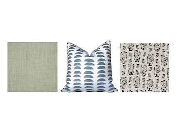
Sunroom Flat Lay.jpg

A Peek at the Aesthetic

My fingers (and wallet!) have been getting a workout this week as I have started to buy items for the room. We are bringing texture to the room with velvet and linen fabric, caning, wood, plants, and, of course, the slate floor! I have ordered some of the art and am debating on the final size of the large piece for above the daybed. The UPS driver just delivered a package. Something in dusty pink velvet! There might be a sneak peak on Instagram in the near future! Here’s what we have left:

The to-do list. Italics=partially completed.

  • Source tile
  • Install tile
  • Paint window frames white
  • Paint room
  • Paint and install new baseboards
  • Source and order lighting
  • Source and order art
  • Build bookcases
  • Build daybed frame
  • Order caning
  • Make daybed cushion cover
  • Sew and purchase pillow covers
  • Install lighting
  • Decide on table top
  • Source seating for table
  • Buy greenery and plants
  • Source accessories
  • Source window treatments

This weekend will be daybed and bookcase building weekend. All hands will be on deck as we try to knock out the focal point of the room 💪. So, make sure to check in next week and see the (hopefully incredible) progress. In the meantime, there are so many amazing rooms coming together over at the ORC blog.

Until next Thursday, Staci

ORC-Guest-400x218.png


One Room Challenge | Week Two | Design Plan and New Floors

It’s Week Two of The One Room Challenge! Now that we have established the before situation, we are getting down to business in the sunroom. This week has been all about finalizing plans and installing a new floor.

If you are coming from ORC and new to KS Design Company, welcome! We are a mother-daughter design team working in Topeka and the Kansas City metro. We started KS Design Company last summer and completed our first One Room Challenge last fall.

SunroomMoodBoard.jpg

The Design Plan

The mood board is complete! Luckily, my husband, Lance is really good about going with the flow when I make design choices in our house. He will give his opinion on major items (more about that later!), but otherwise he says I’m the creative one in the marriage and let’s me plot out the details. Since we are definitely laid back, non-formal people, I wanted a casual and relaxing vibe for the sunroom. I think Kylie and I achieved that with this design plan. It’s light and airy layered with natural elements such as slate, wood, cane, and plants. (Fingers crossed that I can keep the plants alive! No green in my thumb!!) Since the sunroom is off of the great room, I wanted to keep the color palette similar but with less saturated tones, focusing on shades of blue, green, peach, and pink.

Daybed+Focal+Point.jpg

Focal Point

The focal point of the room will be a daybed with bookcases on either side to give it a seamless look. I couldn’t find bookcases in the exact width I needed, so Lance graciously agreed to build them. The big question: Stain the bookcases or paint them white? Any thoughts? We will install a large art print above the daybed and use two wall sconces to help add light at night.


Bistro+Table+Area.jpg

Corner Table

We plan on adding a bistro table for playing games, doing puzzles, or just having a cup of tea. We have a base from an old table, and I am in the process of looking for a top. This is proving to be a little more difficult and costly than expected (Plan B might be making an entrance!). Two stools will flank the table to keep the footprint small. A wall sconce that can extend out over the table will round out this corner. Got to be able to see those puzzle pieces!


Finishing Touches

The finishing touches of the room will include a little glitz in the overhead lighting, some smaller pieces of wall art, plants, containers for storage, and pillows for the daybed. Gosh, I better get started!


IMG_5714.jpg

Floor

The journey to the floor involved quite a bit of leg work and decision fatigue, but I will spoil the ending: the floor is in, and I love it!

Short story: I thought I wanted brick. We went with black slate.

Long story: I had saved numerous inspiration pictures with beautiful brick floors (think Parisian chic). Remember when I said Lance does occasionally chime in on big decisions? Well…he wasn’t sold on brick. He thought it would be rough to walk on and hard to clean. Valid points, I had to agree. My next choice was black slate. Still very organic and has a lot of texture. I had my heart set on a small scale herringbone pattern (similar to what I would have had with the brick floors), which required 3x8 tile. So the hunt began. I found the size I needed at a big box store, but could it be that easy? Nope, no, of course not…Each store location had very limited quantities. Thus, I traveled to three cities buying out all the tile each location had. And I had a border of larger tile installed because there still weren’t enough 3x8 tiles—and I wasn’t going to a fourth city. It ended up being worth it. Nick, our tile installer, worked his magic and the floors are amazing! If you are in the Topeka area, we highly recommend Tile Worx by Nick!

The to-do list. Italics=partially completed.

  • Source tile
  • Install tile
  • Paint window frames white
  • Paint room
  • Paint and install new baseboards
  • Source and order lighting
  • Source and order art
  • Build bookcases
  • Build daybed frame
  • Order caning
  • Make daybed cushion cover
  • Sew and purchase pillow covers
  • Install lighting
  • Decide on table top
  • Source seating for table
  • Buy greenery and plants
  • Source accessories
  • Source window treatments

That’s quite a list. Good thing we love this stuff!!

Thank you for stopping by! Next week we will (hopefully) be saying goodbye to the robin egg blue paint. In the meantime, take a look at the 20 featured designers and other guest participants.

Until next Thursday, Staci

ORC logo.png

One Room Challenge | Week One | Sunroom Needs a New Purpose

It’s One Room Challenge time!

If you are new to our blog, welcome to KS Design Company. My daughter, Kylie, and I started this business last summer and are having a blast working together. We decided to tackle the fall One Room Challenge as guest participants after following along for years as the inspirational and creative designers worked their magic.

If you are unfamiliar with the One Room Challenge, it is a bi-annual event that features 20 featured designers and many guest participants who makeover one room in six weeks. Better Homes and Gardens is the media sponsor.

Last fall’s ORC entailed laughter, hard work, some DIY projects, and maybe even a little bit of panic as Kylie lost her wallet at a Craigslist meet-up. (We did end up with some cool chairs though!) You can check out the final details of our first ORC here. Since we chose a room in Kylie and Matt’s house in the fall, we are going to transform the sunroom in my husband, Lance, and my house this spring. We are ready for round two!
History of the Space

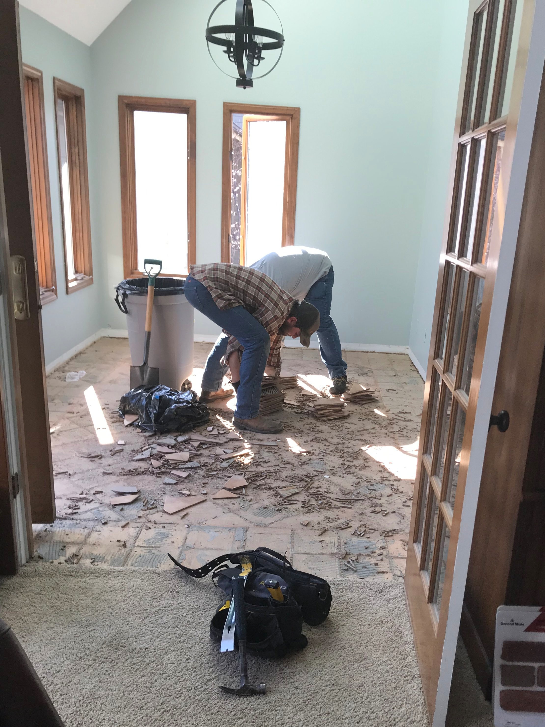
When we moved into our home 15 years ago, this room had a very unusual, unpleasant, unwelcome odor emitting from the bright yellow sponged painted walls. We learned that the previous owner had a ferret, and it’s clear he didn’t like the sponge painting in his space either. 😉 After much airing, cleaning, and painting, the odor was finally gone.

Sunroom Before 1.jpg

Positives of Space

1. Gets amazing light during the day

2. Has a vaulted ceiling

3. Has a door to the deck

4. Has skylights

Negatives of Space

1. Sucks up the light at night

2. Wasn’t wired for ceiling light

3. Is a relatively small space at 9’6” x 12’9”

Sunroom Before Lighting.jpg
Sunroom Before 4.jpg
Sunroom Before 3.jpg

The sunroom is located right off of the great room and is accessed through french doors. In our family, the room originally functioned as a sitting room but was underutilized. Ten or so years ago, I converted it to a craft room. Lots of hours of scrapbooking, finishing kids projects, and wedding designing took place within these four walls. With the digital age, it’s easier to preserve memories online, the kids are grown (where does the time go??), and this room has become a dumping ground for the overflow.

The Sunroom’s New Purpose

  1. We would like to have a place for overnight guest on the main floor.

  2. Our dog, Remi, will turn three during the ORC and will finally be getting old enough to have more freedom while we are out of the house. This will be a perfect place for her to hang out. Lance says she is an expensive puppy to get a room redone to stretch her legs! What can I say? The room is returning to its animal-housing roots after all. 😂

  3. The space will act as storage for frequently used craft supplies. The rest of the stash was donated or is living in another room.

  4. Finally, it will be a quiet place to read, play games, and soak up some vitamin D!

Remi (aka The Real Reason this Room is Getting a Makeover)

Remi (aka The Real Reason this Room is Getting a Makeover)

So, let the work begin. A big shout out to Lance and our son, Keenan, for demoing the floors! (Bookcase building next, pretty please!) Check in next week for the design plan and progress on the floors.

Sunroom+Before+Demo+1
Sunroom Before Demo 2
Sunroom+Before+Demo+3.jpg

Thank you for following along on our journey. Make sure to check out the incredible ORC work being accomplished by the other guest participants and the 20 featured designers.

Until next Thursday, Staci

ORC-Guest-400x218.png